
Recently released and drawing influence from fashion, science, nature, pop culture and global traditions, Sherwin-Williams introduced colormix™ 2014, which captures colors that inspire creativity and design in today’s world. The four-palette collection provides design professionals with a guide to help them define the moods they want to create and select colors for their projects.
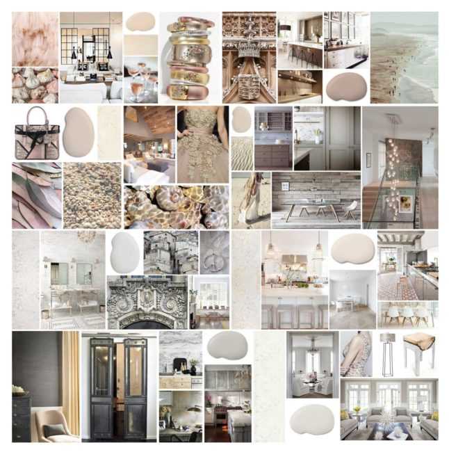
With that, the team at Kerrie Kelly Design Lab was given a sneak peek to the inspiring tones and asked to contribute to the inspiration images for SW’s Diaphanous collection of colors. We were both thrilled and flattered, while we rushed to the dictionary to define “diaphanous”! According to Merriam-Webster, diaphanous means:
See how we interpreted the palette via photos found via Pinterest and some of our own favorite interior design manufacturers below:
SHERWIN-WILLIAMS SPUN SUGAR
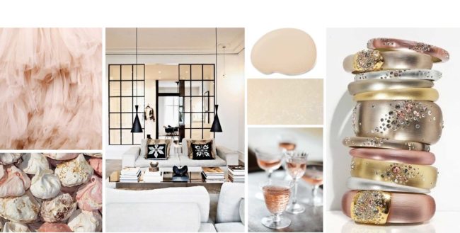
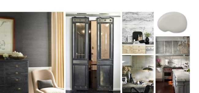
Silk, chiffon, feathers, natural wool, rose gold, barely-there patterns and soft florals are key to this palette. It is about a balance of simplicity, delicate colors and strength tempered by softness. The soft tones of Daria Silestone rounds out our inspiration.
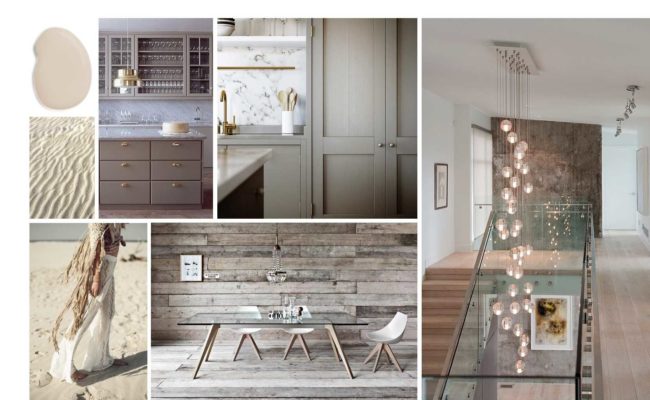
SHERWIN WILLIAMS SAND BANK
The colors of Diaphanous are light, delicate and translucent. Society’s need for over-consumption has given way to minimalism and a quiet reality.
SHERWIN WILLIAMS BEIGE
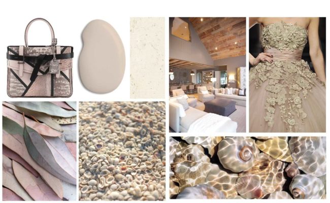
The delicate nature of this palette embodies the very essence of balance, simplicity and elegance. Silestone’s Vortium supports the look.
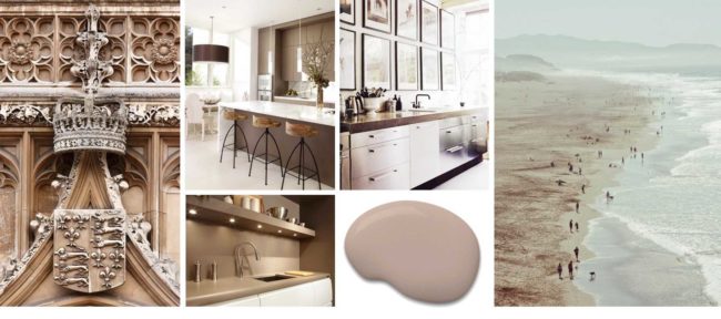
SHERWIN WILLIAMS MALTED MILK
This palette evokes tranquility, sensuality, serenity and escape.
SHERWIN WILLIAMS FLEUR DE SEL
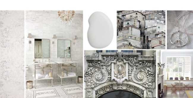
Greyed but still warm in feel, there is a serenity to the aesthetic.
SHERWIN WILLIAMS STEAMED MILK
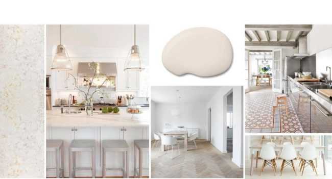
While patterns may still be strong and graphic, the coloration provides a soft approachability to a space.
SHERWIN WILLIAMS NONCHALANT WHITE
Light, delicate and translucent. Picture a pearl veiled by chiffon: a soft gleam behind gossamer fabric. It’s a luxurious image, but luxury isn’t what lures us to it.
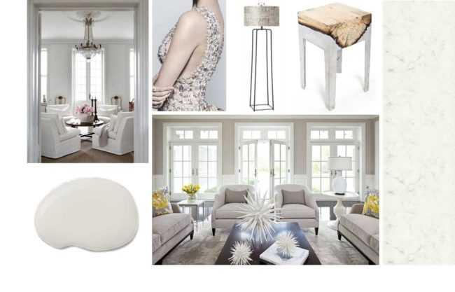
SHERWIN WILLIAMS ALPACA
Instead, it’s the exquisite, spiritual balance of simplicity, delicate colors and strength tempered by softness. Today we experience this gently blurred duality all around is, from the menswear influences on feminine clothes, to the soft-touch materials on electronic gadgets.