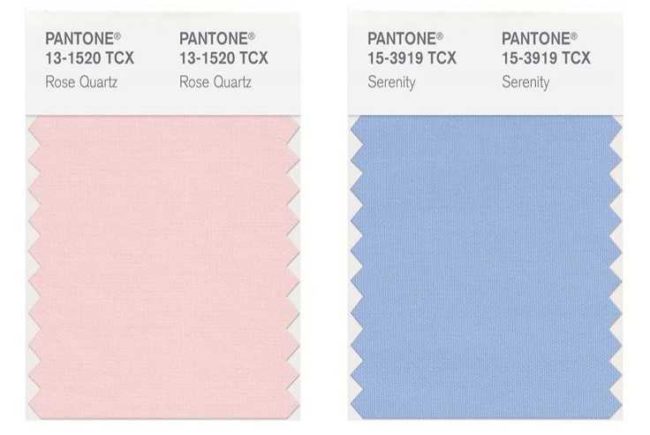
After Marsala, a robust and earthy port color from 2015, we were initially unsure of Pantone’s color choice for this year. Not only were we surprised in seeing double, but we were just as shocked to see such soft and sumptuous colors to supposedly lead us through the upcoming year. Pantone’s choice to unveil two colors, Rose Quartz and Serenity, brought about its fair share of “oohs” and “aahs” as well as a few “huhs” and head scratches. How does a company who made such a bold statement in 2015, switch gears and pile on the pastel for 2016? We took a closer look and came up with a few ideas as to why pretty pinks and powdery blues are stealing the scene for the new year.
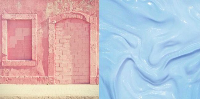
Mind Games
We all know that color has a tremendous impact on our mood. Bright, cheery colors, make us feel, well, cheery. Bold, smoldering colors leave one feeling empowered and particularly courageous. Pantone’s choice of Rose Quartz and Serenity is a step in a serene direction. Calming, ever-cool, and persuasively gentle, the pairing offers a nudge towards long-awaited disconnection. Disconnection from technology, the demands of work, obligations to friends and family, and the stresses of everyday life can leave us burnt out. Pantone saw an opportunity to create a relaxing reality with cool, calm colors, perfect for bedrooms, bathrooms, furniture, and apparel. Step into a room outfitted in Rose Quartz and you can probably feel the stress melt away. Slip on an overcoat in a powdery blue, like Serenity, and feel a cooling sensation take over your body. This color pairing will probably have you saying “What morning meeting?” in no time at all.
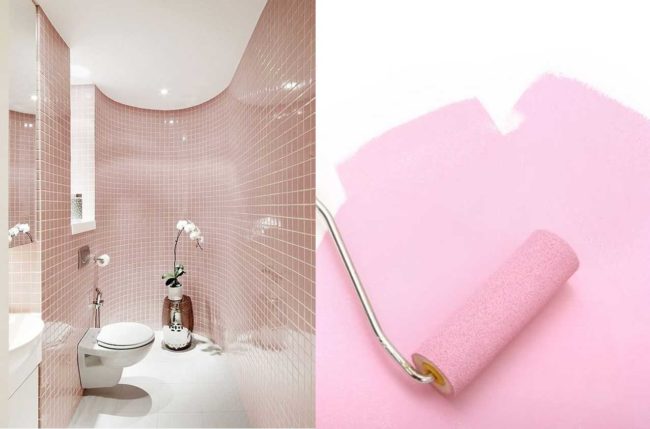
Images via Decor Salteado + Bubbly Blonde Prepster
Blurred Lines
Globally, we are experiencing a shift—a shift in culture, religion, race, gender, politics, design, and well-being. While people are reaching across the aisle, they’re also reaching across the fence, the line in the sand, and the norms that we’ve come to expect. Modern society is challenging what is considered normal or accepted, and people are looking to spirituality, religion, and mindfulness to measure their self-worth and security. With these blurred lines, Rose Quartz and Serenity act as a double-layered security blanket, a warm embrace from a rose tone, and a cooling tranquility bestowed by blue. In design, we are seeing a shift from the hard lines and stark contrast of Scandinavian interiors and looking towards plush surfaces, supple textures, and relaxing ambiance, promoting peace and self-indulgence in living rooms, master bedrooms, and even the great outdoors.
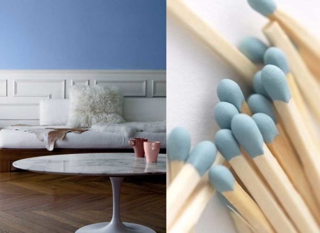
Serene Symbolism
Pantone’s choice to unveil not only one contrasting color from the year prior, but two, shows its commitment to moving forward. Building on the idea that what today’s society deems normal is different than populations of periods past, Pantone’s color duet symbolizes acceptance, partnership, and self-expression. Conformity to fashion and design is out, and thinking outside of the box and challenging typecasts is “in”. Use Pantone’s airy color pairing to break the rules, create your own oasis, and indulge in your favorite outlet during stressful or turbulent times.
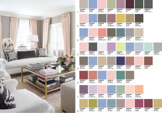
Design Direction
As far as interior design goes, Pantone’s color pairings offers designers and consumers alike the chance to create and reinvent old ideas of classic comfort. Rose Quartz and Serenity can be used as accent colors to bring out a sense of order and peace, or applied in smaller doses using accessories and furniture finishes to calmly complete your look. This duo enjoys the company of both rich colors like brown and fig, as well as shimmering metallic hues and bright bursts of lavender and peach. Whether you choose to represent the pairing in shimmering glossy finishes or matte hues, be prepared for inexplicable respite and relaxation.
What do you think? Will you be using Pantone’s newest color pairing? Share your thoughts in the comments below!
