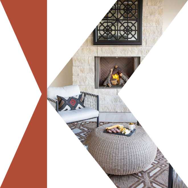
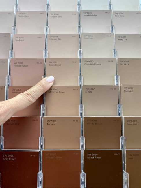
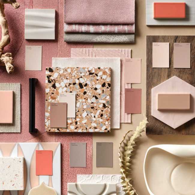
Sherwin-Williams’ 2023 Color of the Year has just been released and is called Redend Point SW 9081. You will find it perched among the tones of Cool Beige SW 9086, Urbane Bronze SW 7048 and Emerging Taupe SW 6045 in the Nexus palette of the Terra 2023 Colormix. This warm hue is neutral enough to use anywhere in your home, inside or out. Not only is it a beautiful accent color but could also make a soothing yet sophisticated statement for an entire room. Redend Point’s warm, deep blush color is the perfect shade for your next update as it creates a lovely glow and a sense of calm. And really, who doesn’t want that for their home?
The Nexus palette provides us with a natural soothing effect while still keeping things light, bright and airy. Lei Flower and Reddened earth give us just enough pop of color while others, like our star, Redend Point, provide the grounding and warmth.
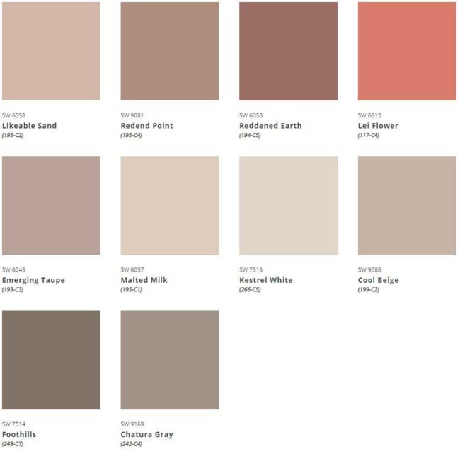
If you’re looking to bring more peace and tranquility to a space in your home, look no further. Redend Point will blend smoothly into any space, especially when using it’s complimentary colors from the Nexus palette.
When we retreat to our bedrooms after a long, hard day’s work, we want to feel a sense of calm and relaxation. We want a space that allows us to shut everything off and hit that reset button so we can do it all over again the next day. Redend point combined with earthy greens, airy blush tones and warm neutrals creates a space that welcomes you in with open arms. It’s not just about the color, either. Consider how pattern and texture play a role in how you feel as well and consider this when selecting pieces.
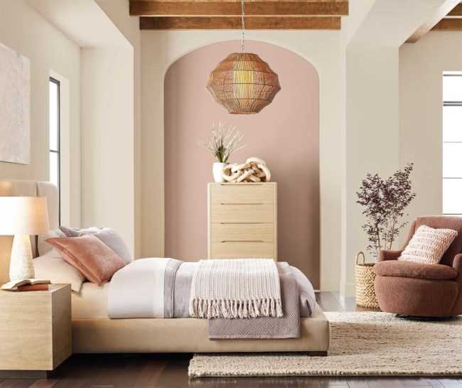
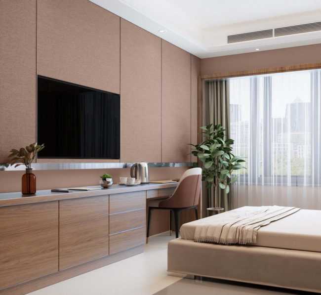
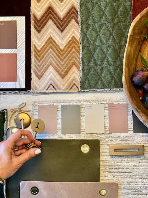
If we look to nature, we can find tones of Redend Point and the Nexus palette all over. From fall leaves and flowers to sand and clay, these tones are almost always right in front of us, yet may sometimes be overlooked. We also can’t forget about catching these colors in a beautiful sunset. Here you will see how they are found oh so frequently in nature’s landscape.


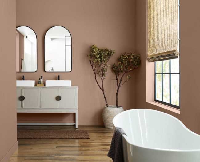
For a spa like experience and a quick, low cost update, consider painting your bathroom walls in Redend Point. So long as your tile is neutral enough to blend nicely with the color, this will bring a new level of comfort. It feels light while still keeping you in a warm embrace and let’s not overlook that texture. Here it is as simple as adding a tree, rug runner and window covering. It brings just enough pattern and texture while keeping the space simple and clean lined.
Don’t forget the contrast! It is easy to fall into the trap of only using the colors you see in the palette but we encourage you to bring in others as well. Specifically, colors that provide some contrast to the space. As you’ve seen in all of the photos above, just about every one is incorporating black to some extent. This is because it brings a gorgeous contrast and acts as an anchor to everything around it. Below you can see a living room that incorporated this in all the right ways. We have black framed windows, drapery hardware and artwork along with some lighter contrasting moments found in the fireplace, floor lamp, and even the base of the chairs. Finally, we see a pop of bold color through the decorative pillows on the sofa.
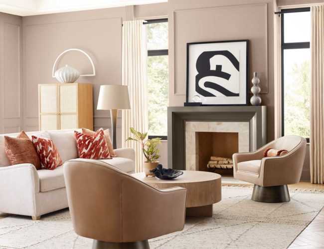
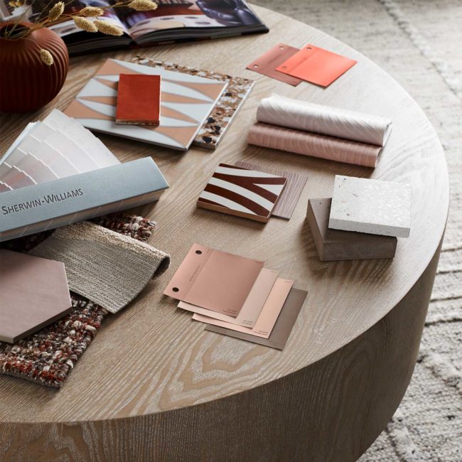
The takeaway. On your next upgrade or remodel, consider Redend Point and colors in the Nexus palette. If you’re feeling like you aren’t quite ready to commit to painting the walls or getting a custom upholstery piece in these colors, consider easing into it with something less permanent. This can be through artwork, pillows, accessories or drapery panels. Doing this will allow you to get used to the idea and test out how much you really like it, while knowing it can be easily swapped out. If you know what you want, we say what’re you waiting for?! Always remember, not just with this palette but in every space, be sure to add contrast and greenery. We know not everyone has a green thumb, don’t worry, faux is great, too! When selecting your pieces, think about color, texture, pattern and finish and don’t think this just has to be through paint, furniture and decor. This can be achieved through tile, stone, wallpaper and even lighting. Lastly, when in doubt, call a designer! They will help you through the process, take the guess work out of it and help you see the vision.
What do you think of this palette and the COTY? Are you ready to ‘go for it’ ?

