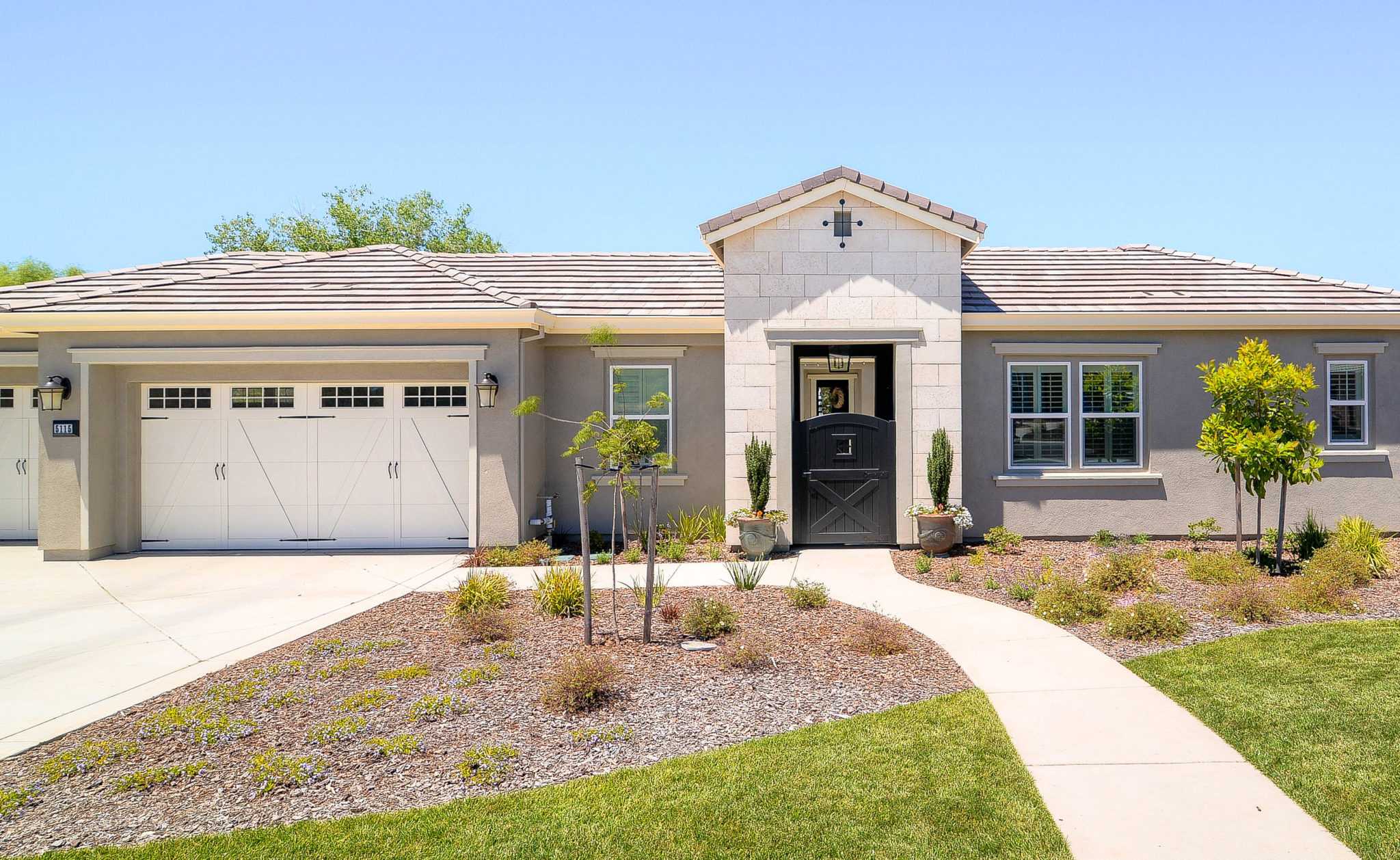
Welcome to the latest installment of ‘The Dressed Nest,‘ where we show off our favorite new project. In this edition, we’re exploring a farmhouse that goes from drab to fab with a few design essentials and a cool, clean color palette.
What was on the client’s mind for their home?
Our clients wanted the space to look put-together and refined, yet durable and low-maintenance. They were looking to create a home that was conducive for entertaining and hosting friends, but kid-friendly, too.
What was the client’s vision?
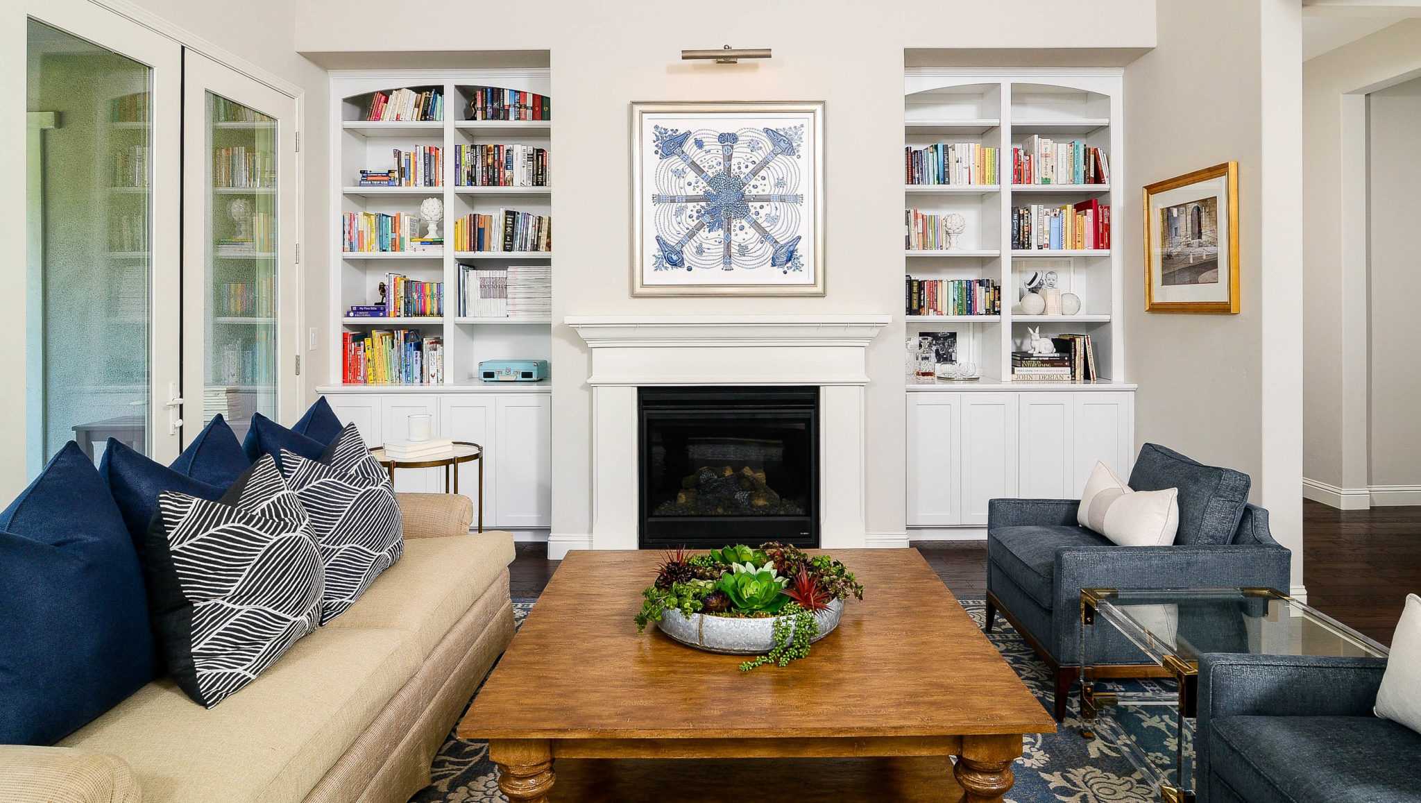
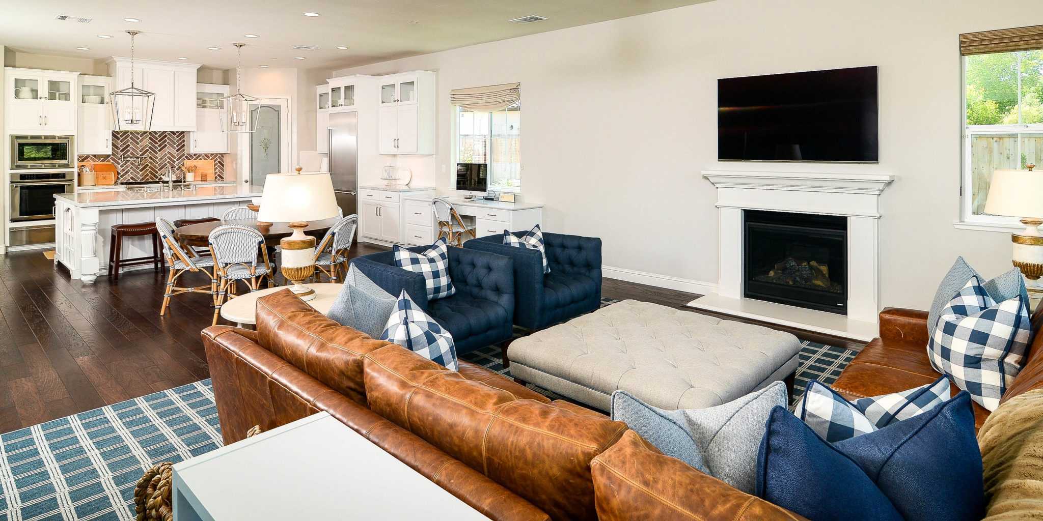
They had ideas for specific elements, but needed our direction for the overall aesthetic. The wife knew she definitely wanted a lot of blue and white, buffalo check, and a hint of lucite and brass. The contemporary living room table was the perfect place to pull this look together as it features both lucite and brass, and its one of the first things your eyes area drawn to upon entering the home.
OK designers, what was the first thing that popped into your head when you walked into the ‘before’ space?
Being a new-build, the bones were beautiful and she had done a great job of selecting some initial materials and finishes. We immediately knew it would be stunning when completed.
What was your favorite part of the design process?
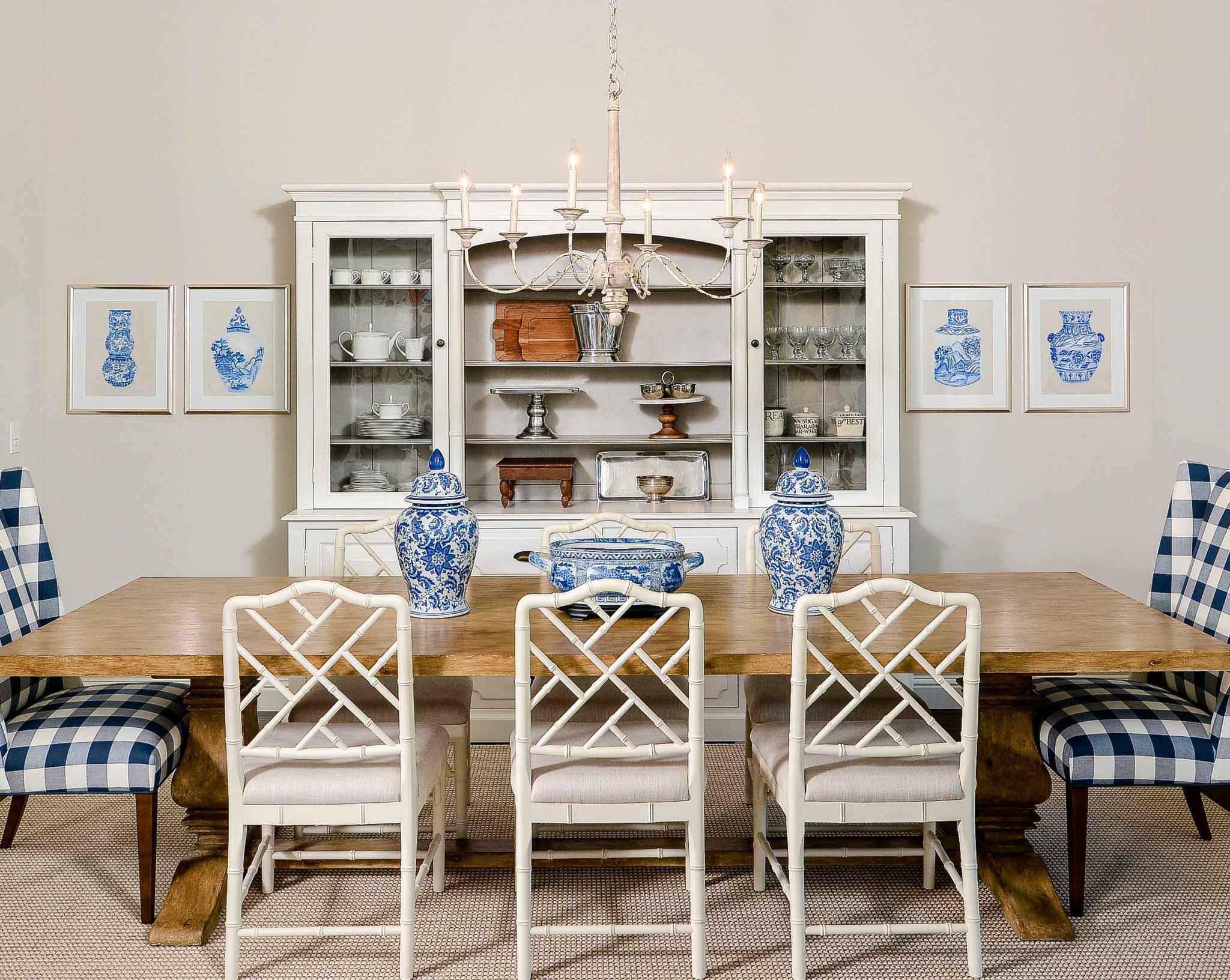
Showing them all of our ideas, definitely. It was so refreshing to have clients who weren’t afraid to commit to pattern. The buffalo check dining chairs and the adorable plaid entry ottoman were their ideas!
What was the biggest obstacle when it came time to design?
The chairs in the living room and family room were originally swapped (living room chairs were in dining room, and vice versa)– Not so much an obstacle as it was a design solution! Luckily, with such a cohesive color palette throughout the home, we easily switched the chairs and the scale fit much better in both spaces. A true win-win!
What is one of your favorite pieces that anyone can grab?
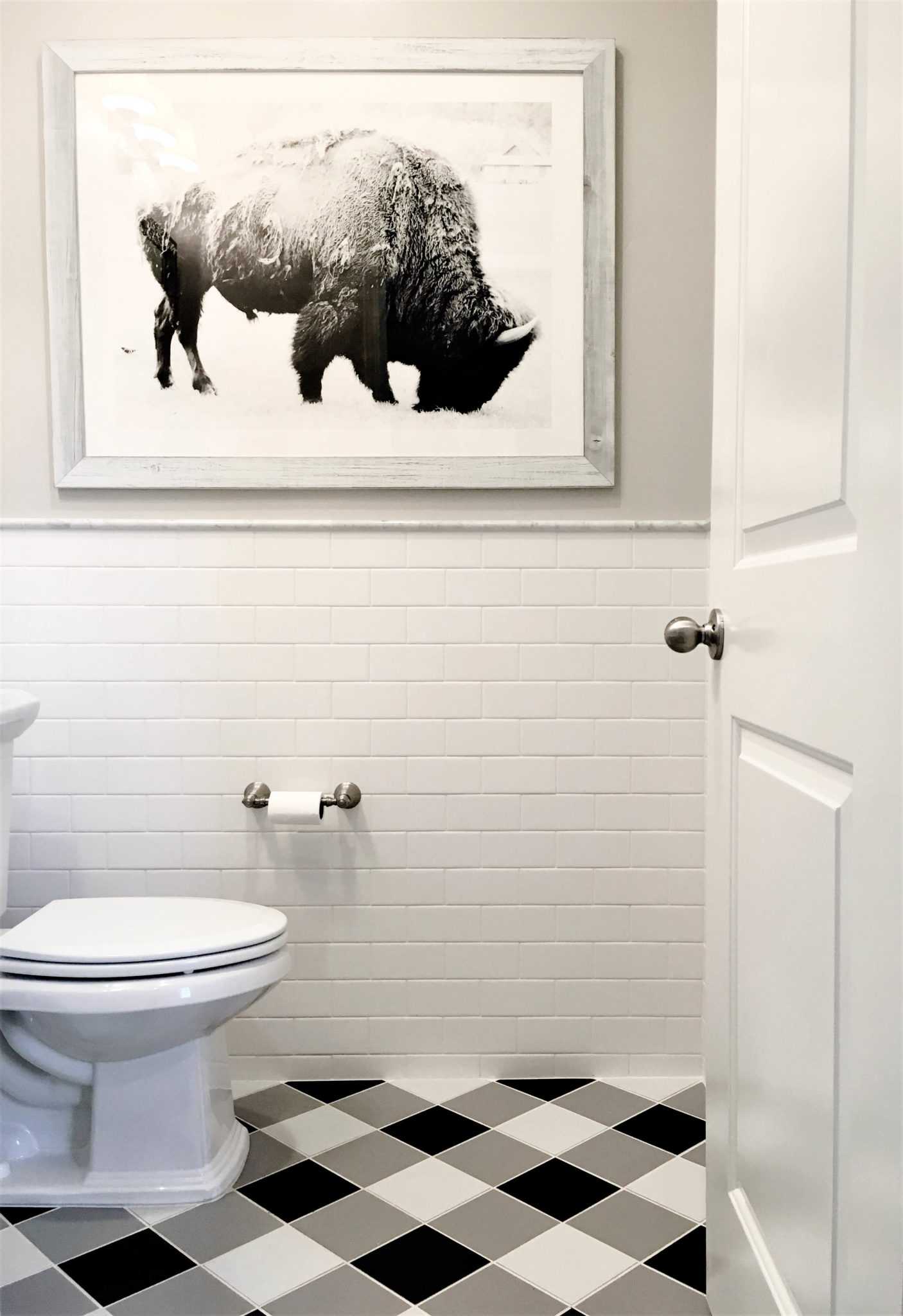
The buffalo artwork in the powder bath is from Minted. We love how it complements the black, white, and gray buffalo tile pattern on the floor. The artwork and the pattern of the floor are both playful nods to the couple’s Buffalo, New York roots. Great conversation starter!
How would you describe the color palette?
Blue, blue, and more blue. With layers of different shades and patterns, we were able to pull together a chic and inviting space filled with plaids, damasks, and checks accented by rich, warm cognac.
How can someone reading this blog ‘get the look’?
Don’t be afraid of pattern! Dip your toe into a “neutral” pattern like plaid or buffalo check via throw pillows or an area rug. Use different tones and shades of your favorite color to add dimension without going overboard on variation– Think navy blue plus a washed-out denim blue plus a sky blue. And don’t forget the finishes! Lucite, brass, and metallic tones add a dynamic touch when placed with soft neutrals and subtle patterns.
