
As though 2017 isn’t moving fast enough, it seems time to think about what’s going to be big in 2018—it is, after all, right around the corner. In terms of design, 2017’s trends have already been discussed, digested, and put away, and now we’re making our way toward the trends for the New Year. With Sherwin Williams and their amazing annual Color Mix Forecast we were able to peek at next year’s color palettes. While we noticed the trends didn’t stray too far from the previous year, they continued to echo process and technology, some of our favorite topics to intertwine with design. Let’s dive into our breakdown of the latest color palettes: Sincerity, Affinity, and Connectivity.

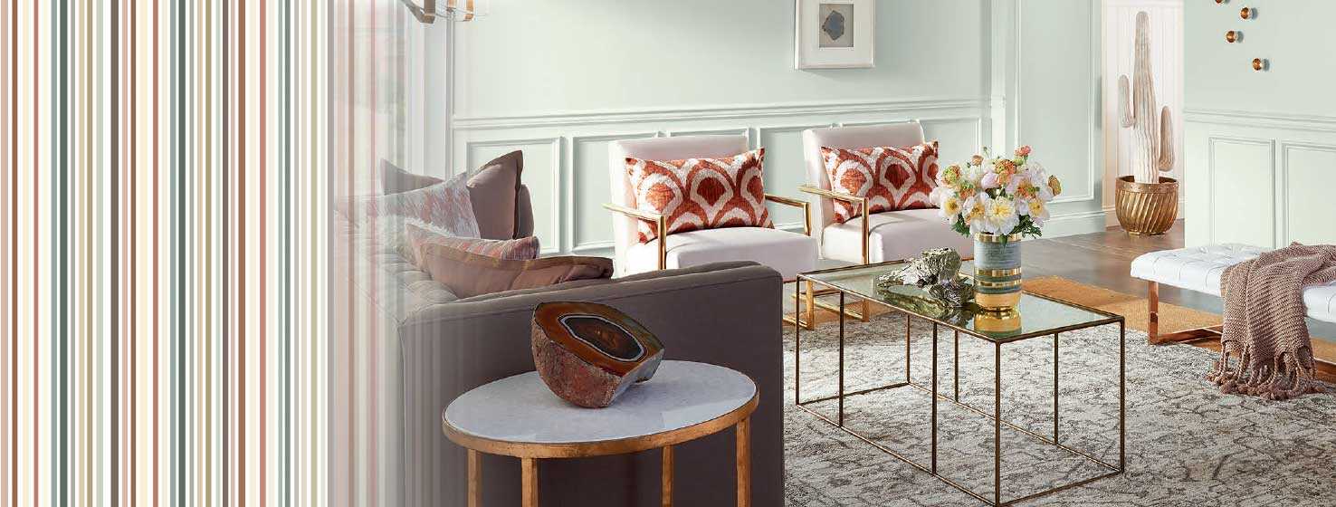
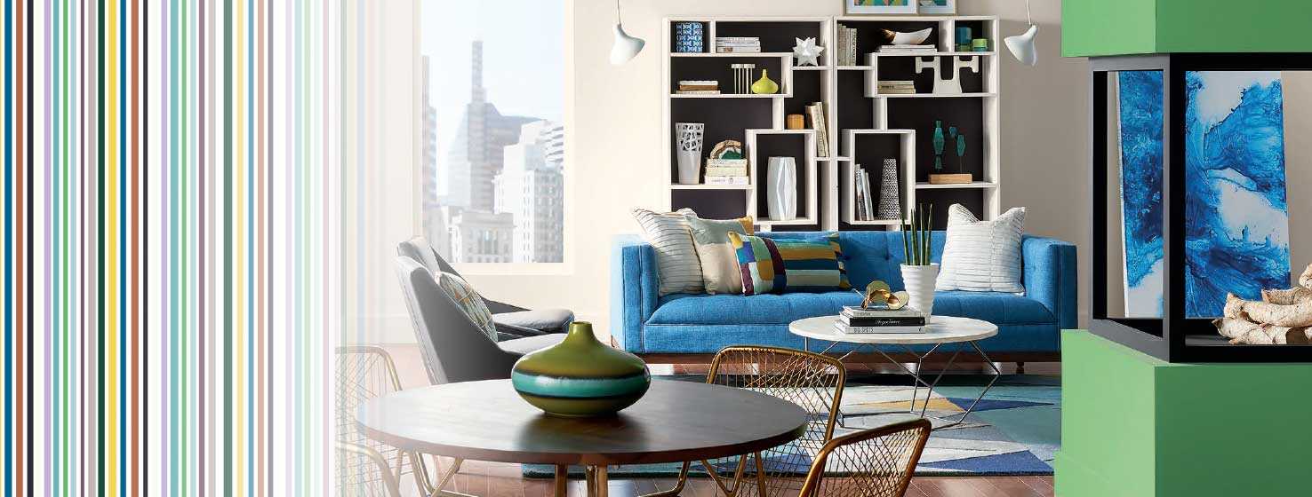
With everyday life mirroring more of a digital reality, it seems that our daily existence is becoming bits of binary information, stored away in a series of 1’s and 0’s. We are constantly shaping and molding our lives to our version of perfection, but Sherwin Williams has us looking at embracing the slip-ups with Sincerity, their first trend unveiling. With the Sincerity palette comes a soft reminder that spaces can emulate our desire to breakaway and retreat to simplicity. With muted browns, misty greens, and multifaceted grays, 2018 is the time we celebrate the unfiltered and creative life.
What This Means for Designers
Don’t hesitate to mix colors on different ends of the spectrum — after all, blending in is the new standing out. Create a cohesive environment with tones that delicately complement one another yet can stand alone in smaller spaces.
What This Means for Homeowners
Don’t think you’re missing out on something if you only want to use brushstrokes of a neutral palette. Create a space that has subtle pops of color that add to the overall calming nature of Sherwin Williams’ Sincerity palette and your home will already begin to feel unplugged and unbothered.
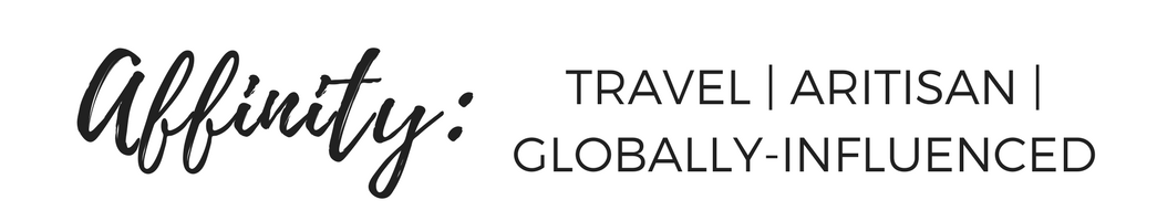
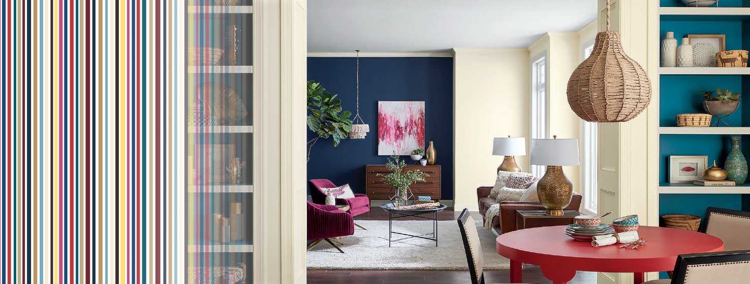
Our world seems to be getting smaller and smaller with styles and cultures integrating regardless of boundaries or distance from Point A to Point B. With that, there’s a movement toward bringing worldly travels home into your own personal dwelling. Out of that curiosity for neighboring cultures emerges Affinity, a color palette drawing inspiration from travel and experiential splurges. This Sherwin Williams color palette, with its bright and bold pops of peacock coloration is perfect for a colorful back-splash in a simple kitchen space or as a daring color choice for a statement casegood or pair of chairs.
What This Means for Designers
It’s time to incorporate bold patterns with nomadic flair. Even the most neutral spaces can benefit from a dynamic pop of color and artisan detail.
What This Means for Homeowners
Splashing color all over your walls is not the only way to bring this bright and bold trend into your home. Dip your toe in with pattern-forward throw pillows and linens, and work your way into larger pieces like statement area rugs, art, and accessories.

It seems nearly impossible to break away from the ever-evolving technological world in which we live, but with this willing incorporation of techies creating our world and becoming our rock stars, we should no longer deny the fact that our world is connected in a multitude of ways. This means a shift in adopting innovative ideas and Utopian ideals. Honing in on our love for all things tech comes the Connectivity palette from Sherwin Williams, a collection of high-definition shades and tones. This palette is full of bright colors, sunny yellows, electric greens and cool oranges.
What This Means for Designers
Embrace color like it’s your long-lost best friend! Jump into this innovative color collection by mixing different shades of your favorite go-to—think bright red cooled down by a soft blush, or warm yellow given new life with airy off-white.
What This Means for Homeowners
Start in one room and your work your way out. Spice up the guest bedroom with a strong red color palette, incorporating different shades for added dimension and soft textures to bring the boldness down a notch or two.