Each year, Sherwin-Williams inspires us with a stunning array of colors that set the tone for interiors across the globe. The 2026 Colormix® Forecast: Anthology, Volume 2, is no exception—bringing together timeless hues, thoughtful neutrals, and bolder, nature-inspired shades that elevate every space they touch.
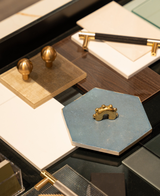
We’re particularly excited to incorporate these colors in our upcoming projects with Plain & Fancy and Fabuwood, as well as in the Hestan Napa tasting room, showroom, and restaurant space this September. Later this fall, we’ll also see these hues come to life in permanent installations with Cosentino and The NKBA at Broad Hall in High Point, NC, opening during October Market.
Here are some of my favorite colors in this year’s Anthology, along with how we’d pair them with some of our favorite brands:
Frosted Tints
Cool, Ethereal, Elevated
Lavender, seafoam, and sky blue take center stage in this dreamy palette of airy, icy pastels. Frosted Tints is all about creating moments of visual weightlessness. Think tonal layering, spa-inspired sanctuaries, and color-drenched interiors that feel both intentional and effortless.
We anticipate these hues shining in wellness spaces, boutique hospitality projects, and residential interiors that lean biophilic and soothing. They invite designers to embrace softness without sacrificing sophistication—Ideal for accent walls, powder rooms, or millwork moments that want to whisper, not shout.

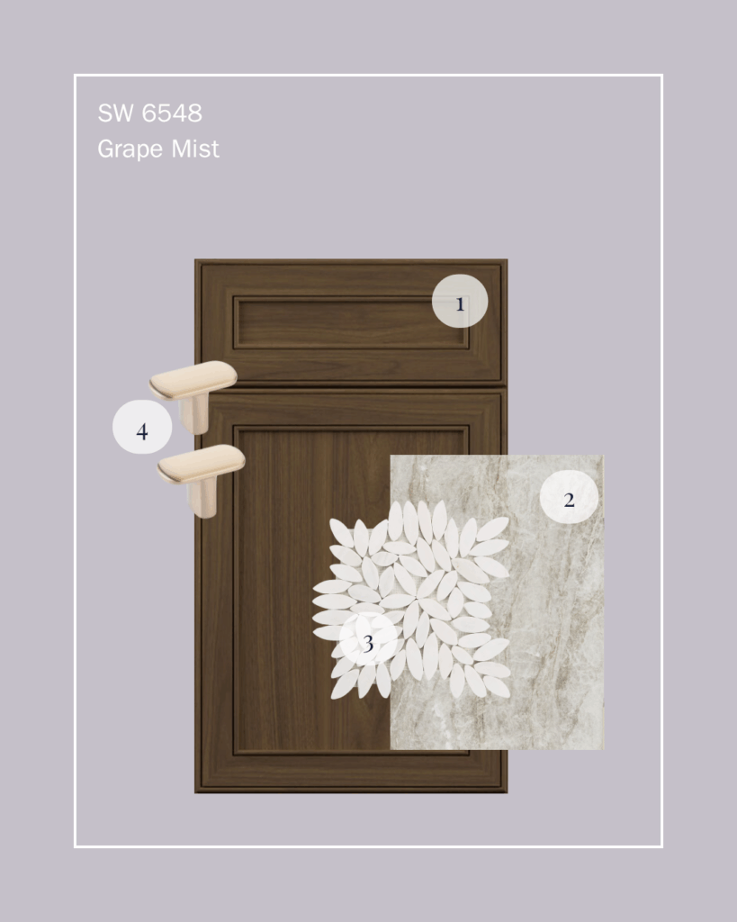
SW 6548
Grape Mist
A soft, romantic purple with a subtle gray undertone, bringing a fresh yet timeless elegance to cabinetry and accent walls.
(Find me at Fall Market!)

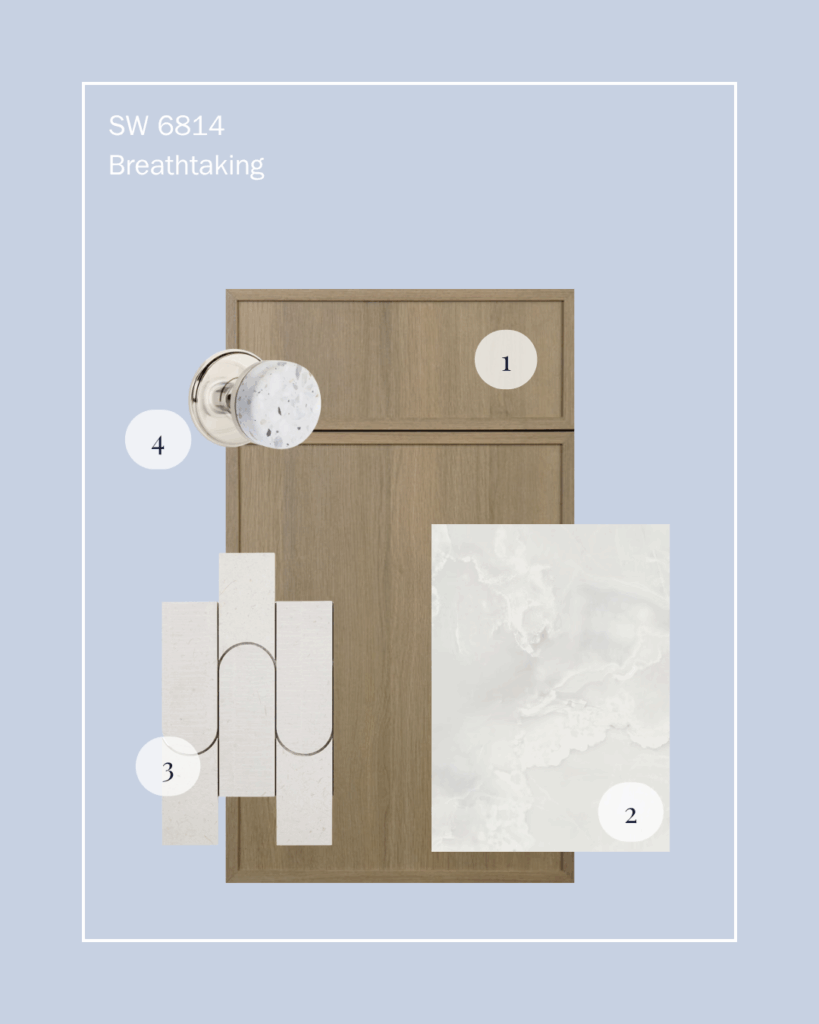
SW 6814
Breathtaking
A breezy, coastal-inspired blue that pairs beautifully with natural wood tones, perfect for creating calm and airy open-concept kitchens.
Sunbaked Hues
Earthy, Expressive, Nostaligic
From burnt reds and terracotta to golden ochres, this collection is a designer’s dream for creating interiors infused with a playful, grounded energy. With a nod to organic modern and new traditionalism, they balance boldness with familiarity.
Designers can use these hues to layer color stories in artisan kitchens, cozy reading nooks, and heritage-inspired renovations with a fun flair.

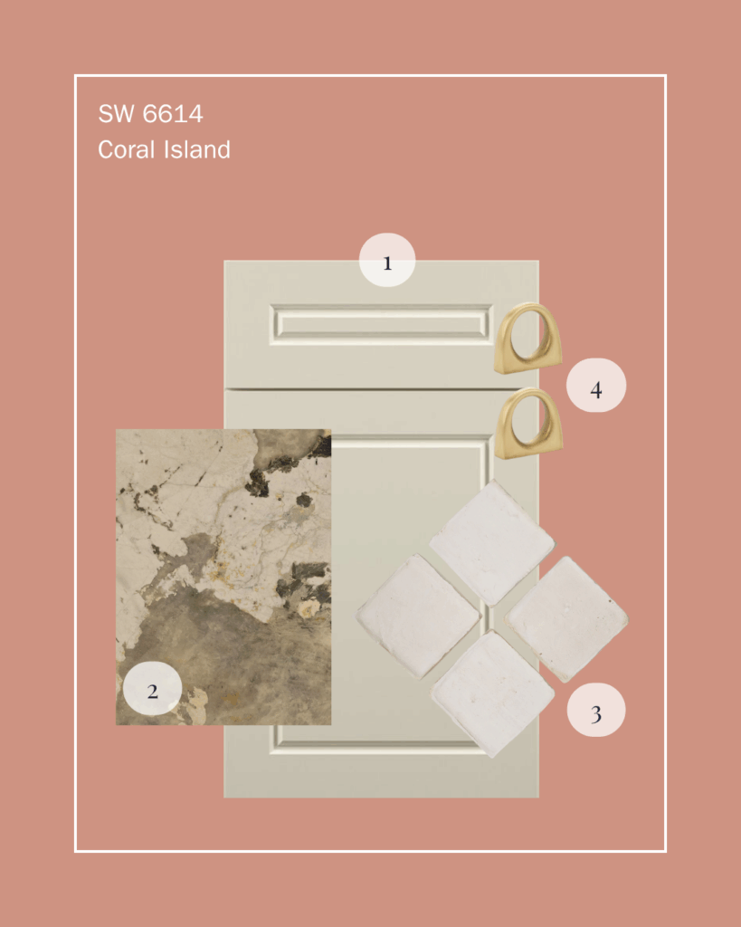
SW 6614
Coral Island
A vibrant, sun-drenched coral that instantly energizes a space, ideal for accent walls or playful bar seating.
(Find me at Fall Market!)

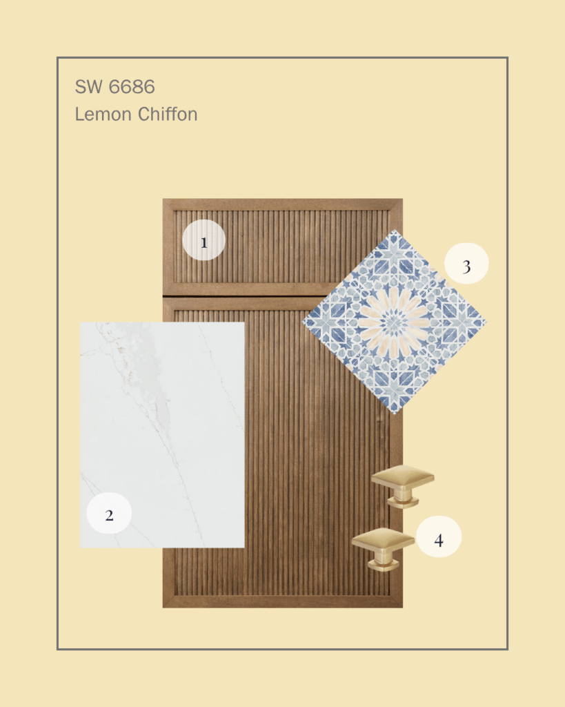
SW 6686
Lemon Chiffon
A soft, cheerful yellow that radiates warmth and comfort, making kitchens and breakfast nooks feel bright and welcoming.
Restorative Darks
Moody, Luxe, Grounded
In a world that’s craving calm, Restorative Darks delivers—offering Designers a moody mix of nocturnal hues that anchor a space and evoke a quiet sense of luxury. Charcoal, espresso, aubergine, and pine green are no longer just accent colors—they’re leading the charge in cabinetry, paneled walls, and immersive interiors.
This palette feels at home in high-end hospitality, masculine retreats, or anywhere designers want to create a sense of intimate drama. These shades play beautifully with natural stone, aged metals, and plush textiles—hallmarks of the slow living and quiet luxury design movements.

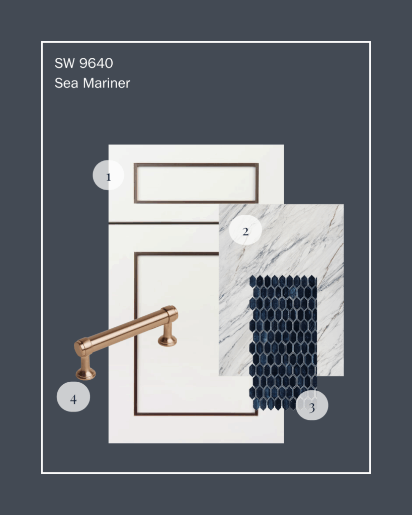
SW 9640
Sea Mariner
A rich, deep blue that feels modern and timeless, anchoring a space with a sense of calm sophistication.
(Find me at Fall Market!)

SW 6053
Dark Auburn
A bold, earthy red-brown that adds warmth and depth, ideal for creating cozy, layered dining experiences

Foundational Neutrals
Timeless, Tailored, Versatile
From inky black to soft mushroom and silvery taupe, this refined palette redefines what it means to be “neutral.” Foundational Neutrals offers Designers a sophisticated starting point grounded in classic sensibility.
We anticipate these hues providing balance in open-concept homes, transitional interiors, and minimalist luxe environments. They’re ideal for full-home palettes, creating a seamless flow between spaces while allowing architectural details and hard surfaces to shine.


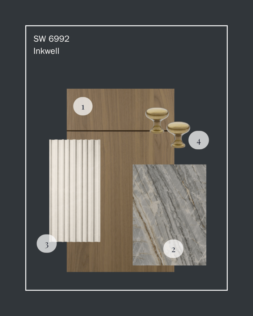
SW 6992
Inkwell
A luxurious near-black with a hint of blue, offering a sleek, modern alternative to traditional black cabinetry or accent walls.

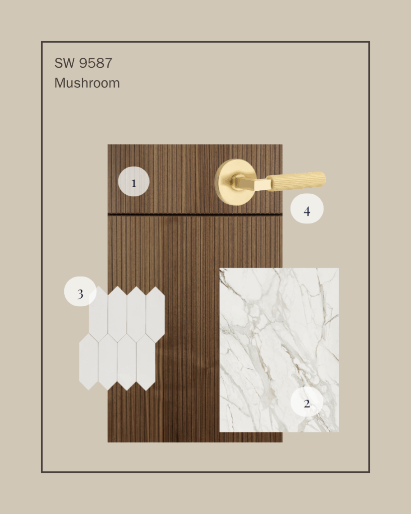
SW 9587
Mushroom
A perfectly balanced warm taupe that complements a variety of finishes, from brushed brass to natural woods, making it endlessly versatile.
We love how the Anthology: Volume 2 collection celebrates both familiarity and discovery—honoring heritage colors while inviting us to see them in a fresh, modern context. These hues will help us create spaces that feel curated, personal, and truly connected to the way we live today.
Stay tuned as we unveil these palettes in our upcoming projects, from the heart of Napa Valley to High Point Market this fall. The future of color is looking brighter—and more beautiful—than ever.
Like what you see?
There's more where that came from.