I’ve been saying blue is the color of the decade since 2010. And for good reason. Blue has been one of the most enduring, versatile, and universally loved colors in design, finding its way into everything from kitchen cabinetry and upholstery to decorative accessories and architectural finishes.
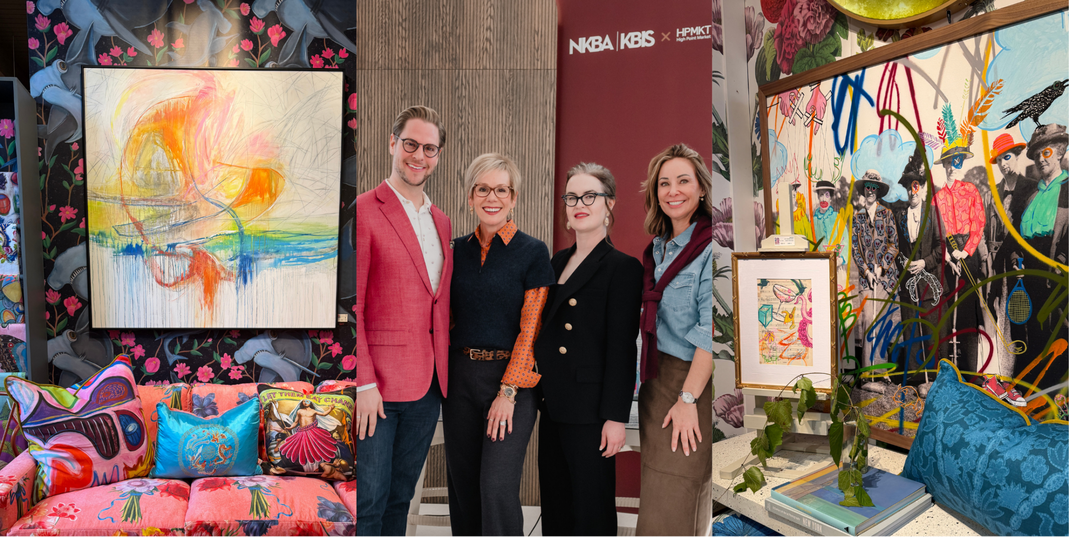
But during a recent visit to the Sherwin-Williams DesignHouse in Greensboro, North Carolina, while attending High Point Market, Sue Wadden, Sherwin-Williams’ Director of Color Marketing and one of the industry’s leading voices in color forecasting, challenged me to rethink that narrative.
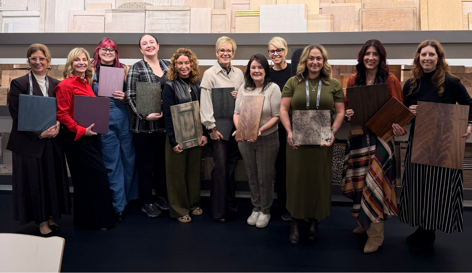
“Kerrie, we need to stop saying blue is the color of the decade.”
And you know what? She has a point.
From Blue to Green: A Color Evolution
Color trends rarely change overnight. They evolve, influenced by culture, nature, technology, and how we want our homes to make us feel. While blue has enjoyed an extraordinary run, green has been quietly gaining ground—and now it’s taking center stage.
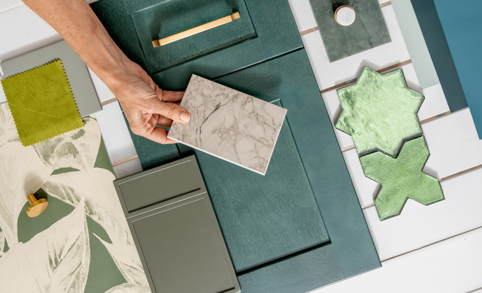
We’re seeing greens become more nuanced, sophisticated, and livable. Think less saturated emerald and more dusted, smoked, and botanical tones that feel collected rather than newly decorated.
Part of this evolution is the growing influence of yellow. As warmer undertones make their way into our palettes, greens are becoming softer, earthier, and more complex. These yellow-influenced greens bring a sense of warmth and optimism that feels particularly relevant to how we’re living today.
And when paired with natural wood? It’s a beautiful combination.
What the Sherwin-Williams DesignHouse Taught Me
One of the most fascinating parts of our visit was seeing the extraordinary range of applications for wood coatings. From baseball bats and furniture to kitchen cabinetry, Sherwin-Williams demonstrated just how much innovation is happening beyond the traditional paint can.
As Creative Director of Fabuwood, I found this especially inspiring.
Cabinetry is no longer simply a choice between painted and stained finishes. Advances in coatings, textures, and application techniques are expanding what’s possible, giving designers new opportunities to celebrate wood grain, experiment with color, and create finishes that feel both expressive and enduring.
For me, the biggest takeaway was that color and materiality are becoming inseparable. A beautiful green cabinet is one thing, but a beautifully considered green finish alongside the warmth and character of natural wood creates an entirely different experience.
Celery Is Having Its Moment
Sherwin-Williams’ selection of Celery as a Color of the Year reinforces this movement toward yellow-influenced greens.
It’s a direction that feels fresh without being frivolous, rooted in nature but sophisticated enough to translate across traditional, transitional, and contemporary interiors.
What I particularly love about this color family is its versatility. These greens can act as a neutral, introduce subtle contrast, or become a defining design statement. Paired with white oak, walnut, or other natural wood finishes, they create spaces that feel grounded, welcoming, and effortlessly layered.
For kitchen design, especially, this is an exciting evolution. We’re moving beyond the idea that cabinetry needs to be either a safe neutral or a bold statement. There’s a beautiful middle ground where color, texture, and natural materials work together.
Will Blue Make a Comeback in 2030?
Absolutely. At least, that’s my prediction. Color has a way of moving in cycles, and I don’t believe blue is disappearing. It’s simply making room for a new chapter.
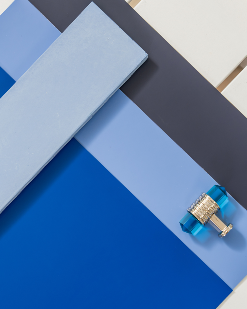
My theory? We’ll move through this yellow-green moment, gradually see cooler undertones return, and likely make a stop at teal before blue takes center stage again.
By 2030, we may very well be talking about blue as the next big thing. And I’ll be ready.
Because while Sue Wadden may have convinced me to retire my favorite color prediction for now, she hasn’t changed my appreciation for blue. She’s simply reminded me that the most exciting part of design is recognizing when it’s time to see something familiar in a completely new way.
So, Sue, I’m officially giving green its moment. But I’m keeping blue on the calendar for 2030! 😉
Like what you see? Read Our Latest