
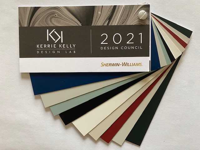
Have you heard? Sherwin–Williams just published our #KKDL Top Ten Favorite Sherwin–Williams Paint Colors! We even celebrated with a #KKDL x Sherwin–Williams fan deck giveaway so you would have a chance to experience the colors live and in person. To give you a little background on why we call these colors our “tried-and-trues” check out the below projects, paint chips and reasons we love these hues.
Snowbound, SW 7004 (256-C2): This hardworking, all-purpose shade is bright and clean without being stark and cold. A go-to for trim, walls and cabinets, it never goes out of style.
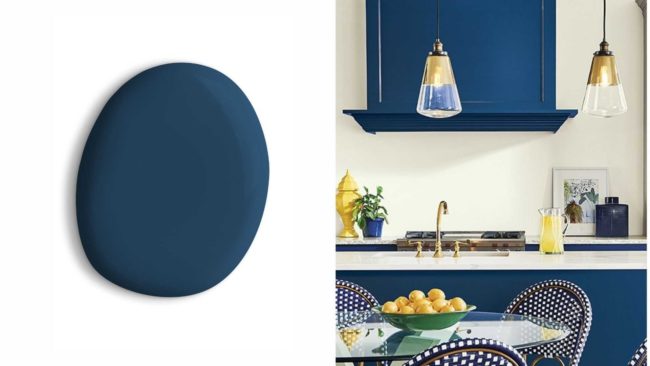
Salty Dog, SW 9177 (253-C2): This grounding blue is a deep twist on classic navy blue. The rich hue creates a calm yet confident environment infused with quiet sophistication.
Repose Gray, SW 7015 (244-C1): A timeless mix of gray and beige, this shade is ideal for interior walls and exteriors. Its subtle gray undertones allow it to create a clean warmth in a variety of design styles.
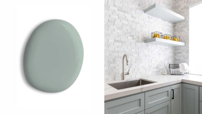
Halcyon Green, SW 6213 (218-C3): This mid-shaded bluish-green hue depicts the ultimate colors of nature. Sharing undertones with shades of glass and succulents, it’s a proven versatile color.
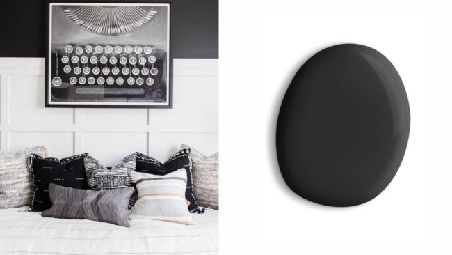
Tricorn Black, SW 6258 (251-C1): One of the richest, most neutral blacks, it is void of undertones and pairs beautifully with nearly every shade. Its stunning tone makes a statement in any room it’s used.
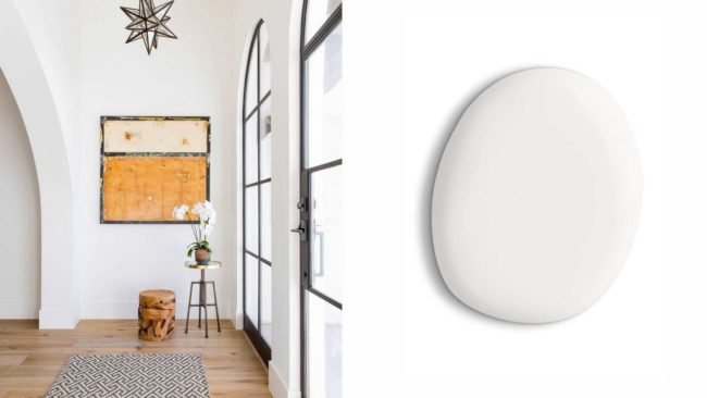
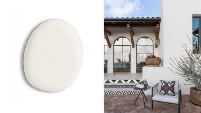
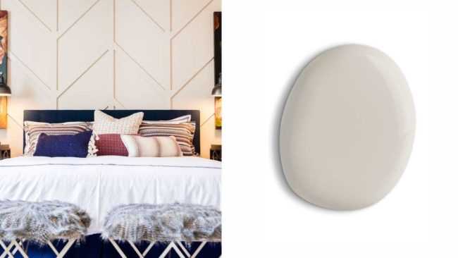
Alabaster, SW 7008 (255-C2): Neither stark nor overly warm, this understated and alluring hue of white provides an oasis of calmness, spirituality, and “less-is-more” visual relief.
Accessible Beige, SW 7036 (249-C1): A timeless hue that leans toward taupe, this warm hue allows for a blending of taste and style. While it is considered neutral, the color is anything but boring.
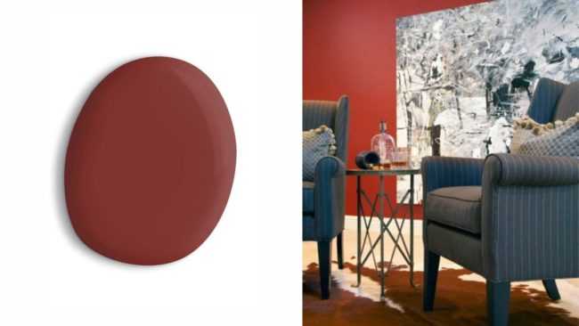
Salute, SW 7582 (275-C2): Not too orange, not too bright, and not too burgundy, this red is rich, playful, and powerful. Perfect for making a statement or greeting guests at the front door, it can just as easily update a furniture piece.
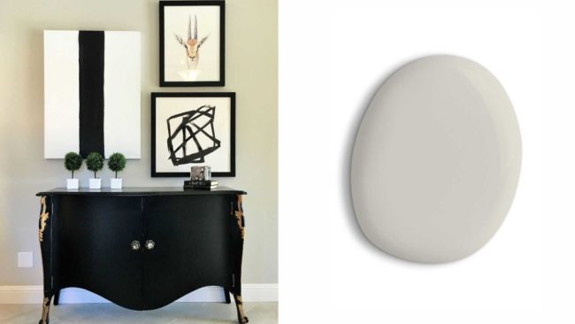
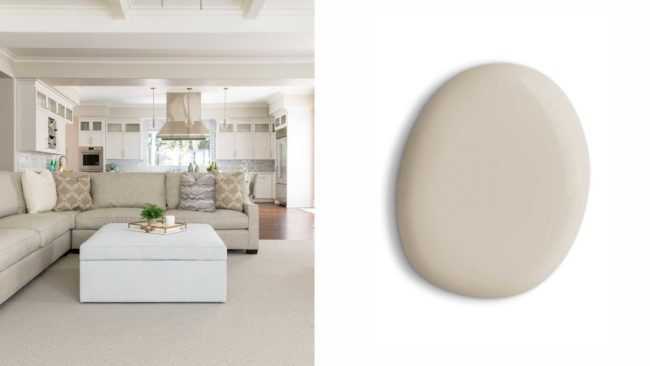
Agreeable Gray, SW 7029 (243-C1): Celebrating brown undertones, this gray reads soft like cashmere. Warm yet light, this neutral provides a beautiful backdrop without overwhelming a room.
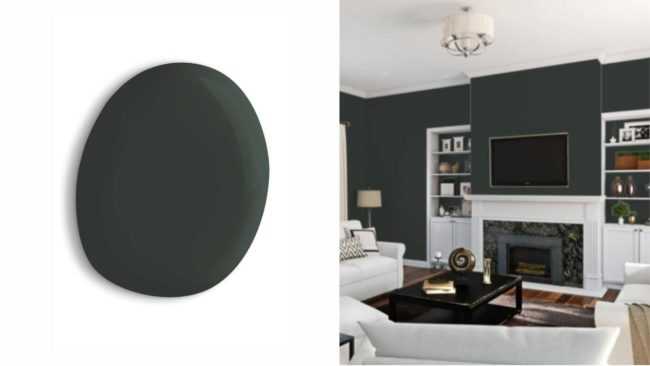
Jasper, SW 6216 (218-C7): This elegant historic hue exudes a masculine sensibility. Pair with brushed gold accents and rough-hewn brown leathers for a moody yet dignified aesthetic.
We hope you will continue to follow along our Sherwin–Williams color journey! What color will you try? Let us know in the comments below—we always love to hear about your projects!