Unlike the quiet restraint and refined layering that defined Milan Design Week this year, London arrived with a wink, a playlist, and a fearless use of color. From Clerkenwell Design Week to Chelsea in Bloom, the city felt playful, expressive, nostalgic, and unapologetically individual — almost as though London collectively decided that joy itself was the trend.
More than a trend report, these are observations around a city that embraces personality, celebrates heritage without taking itself too seriously, and understands the power of creating memorable moments.
Perhaps it’s the moody skies that make London crave color. Or perhaps it’s simply the city’s enduring confidence in self-expression. Either way, London reminded us that design can—and should—make people smile.
01. Color as a Mood Booster
Dopamine Dressing Moves Into Interiors
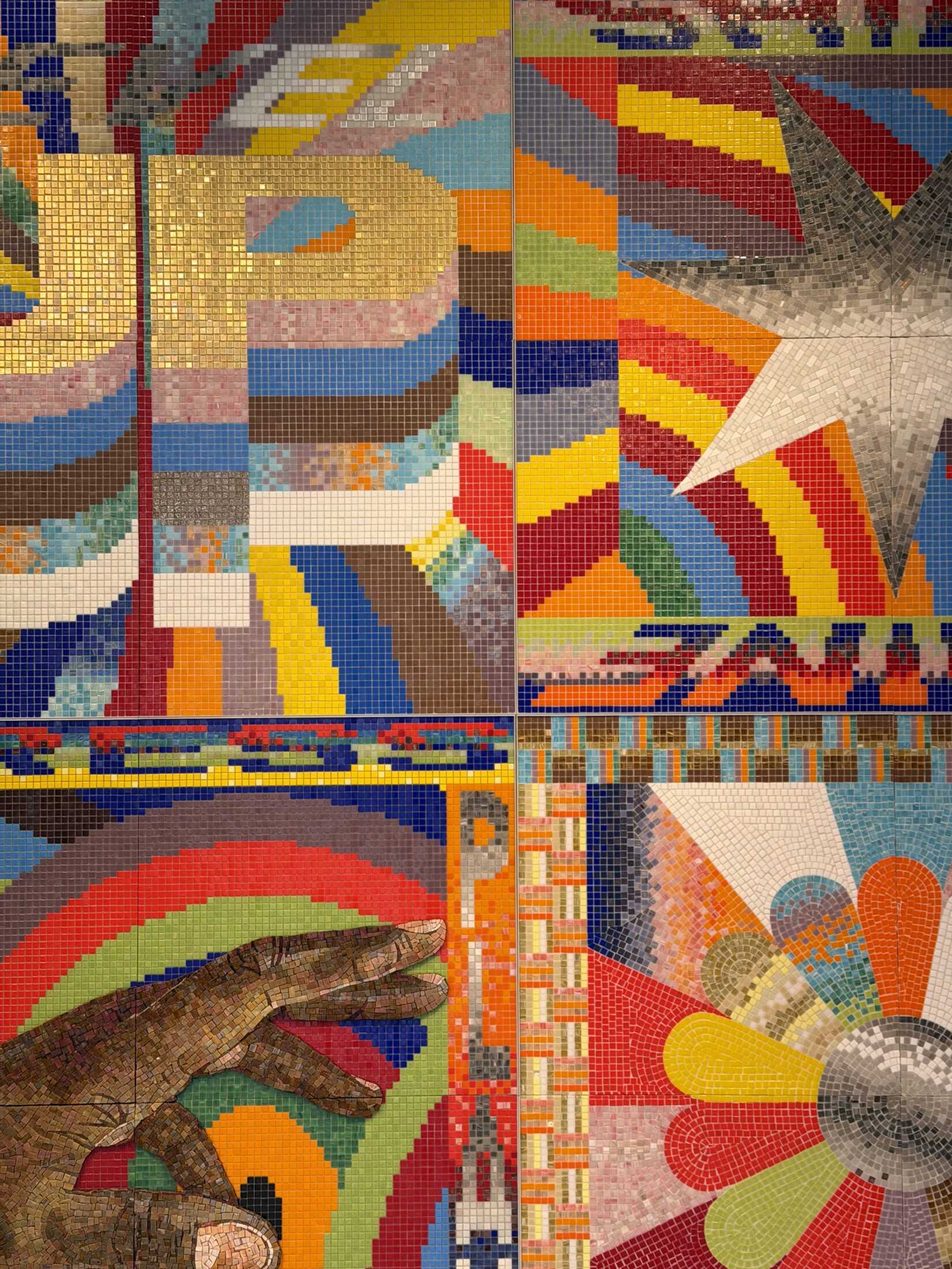
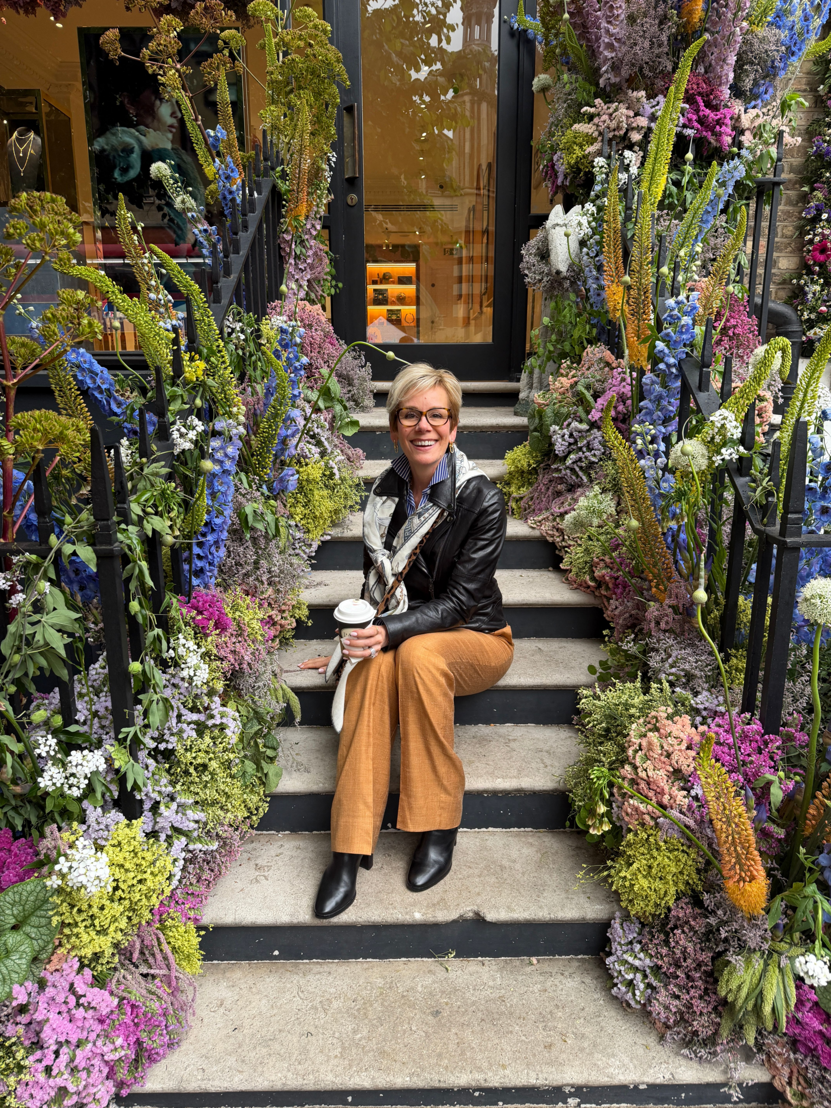
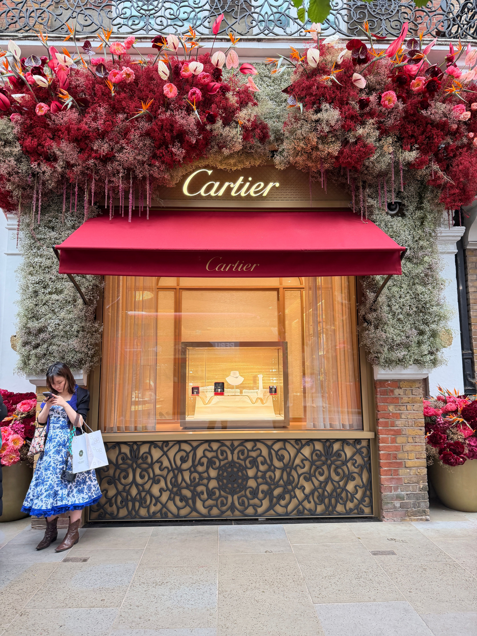
While Milan leaned tonal and textural, London embraced vibrant color combinations with confidence. Cherry reds, butter yellows, racing greens, powder blues, and punchy pinks appeared everywhere—from storefront installations to floral activations and hospitality environments.
But this wasn’t color for shock value. It felt emotional. Optimistic. Comforting.
Across fashion, interiors, restaurants, and retail moments, color was used to spark delight and encourage interaction. Even heritage brands embraced playful palettes and layered storytelling.
02. Nostalgia—But Make it Cool
Childhood References Reimagined for a Design-Literate Audience
One of the strongest undercurrents throughout London was nostalgia—but not in a precious or vintage-store way. Instead, designers referenced childhood memories through playful motifs, music references, roller skates, cheeky sayings, candy colors, stripes, florals, and whimsical storytelling.
The result felt emotionally familiar while still visually elevated.
London seems deeply comfortable balancing sophistication with humor—something many luxury markets are only beginning to embrace.
The spaces that resonated most emotionally were the ones that didn’t take themselves too seriously.
03. Fashion Informing Interiors
Self-Expression Is the New Luxury
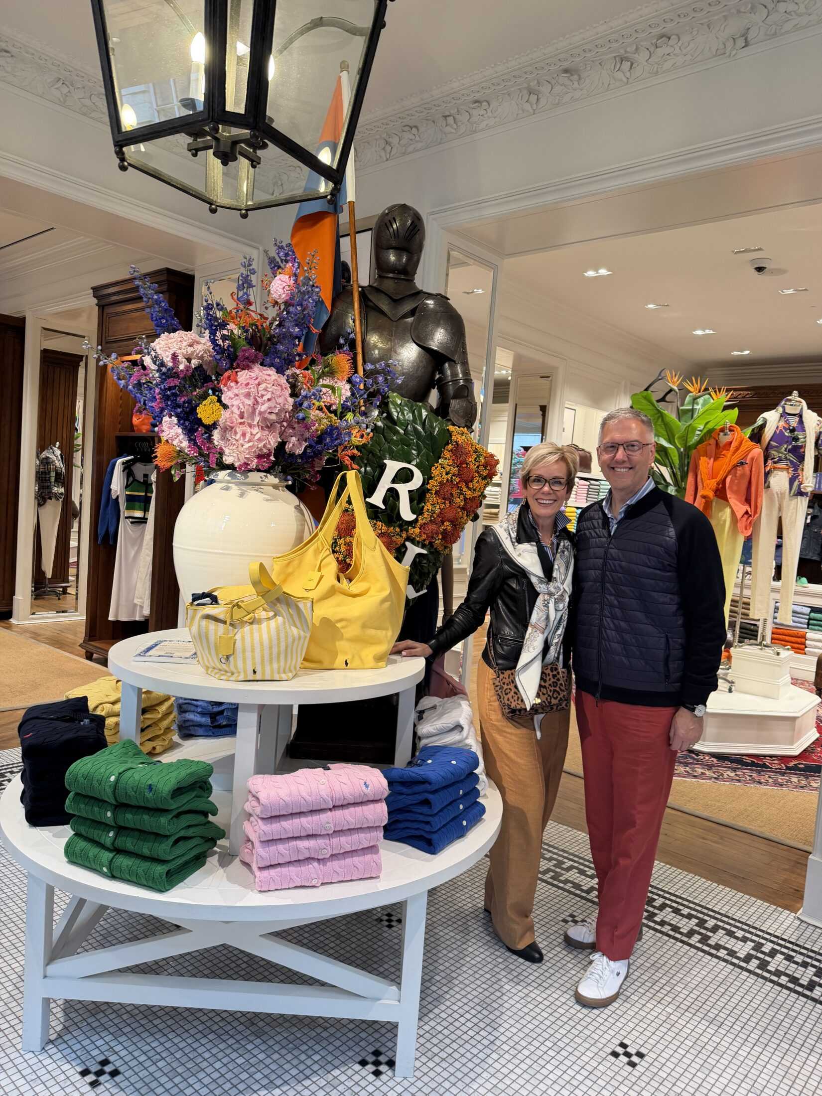
London’s fashion culture feels inseparable from its design culture. Everywhere we looked, personal style informed interiors—layered prints, unexpected color pairings, mixed eras, and bold accessorizing translated directly into hospitality, retail, and showroom experiences.
There’s an ease to London style that feels collected rather than overly curated.
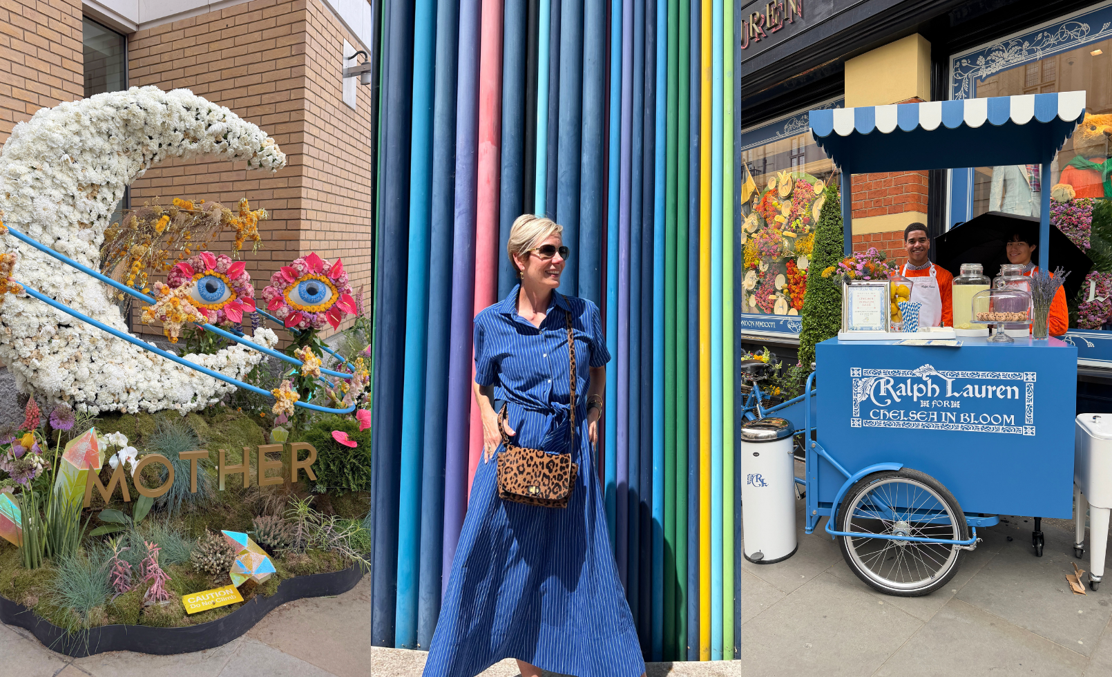
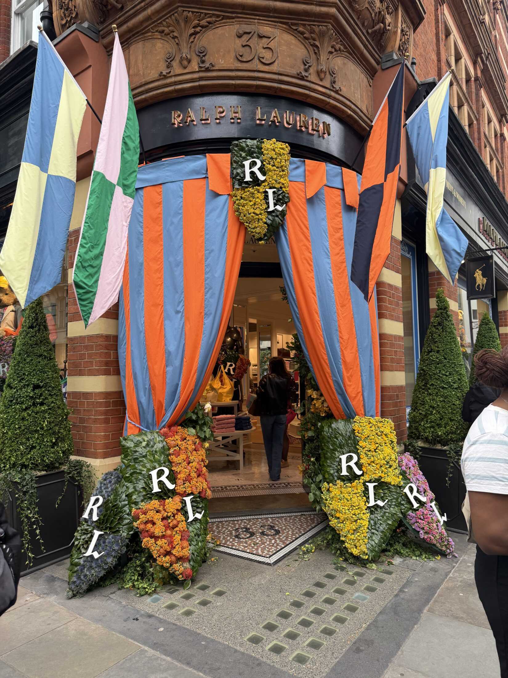
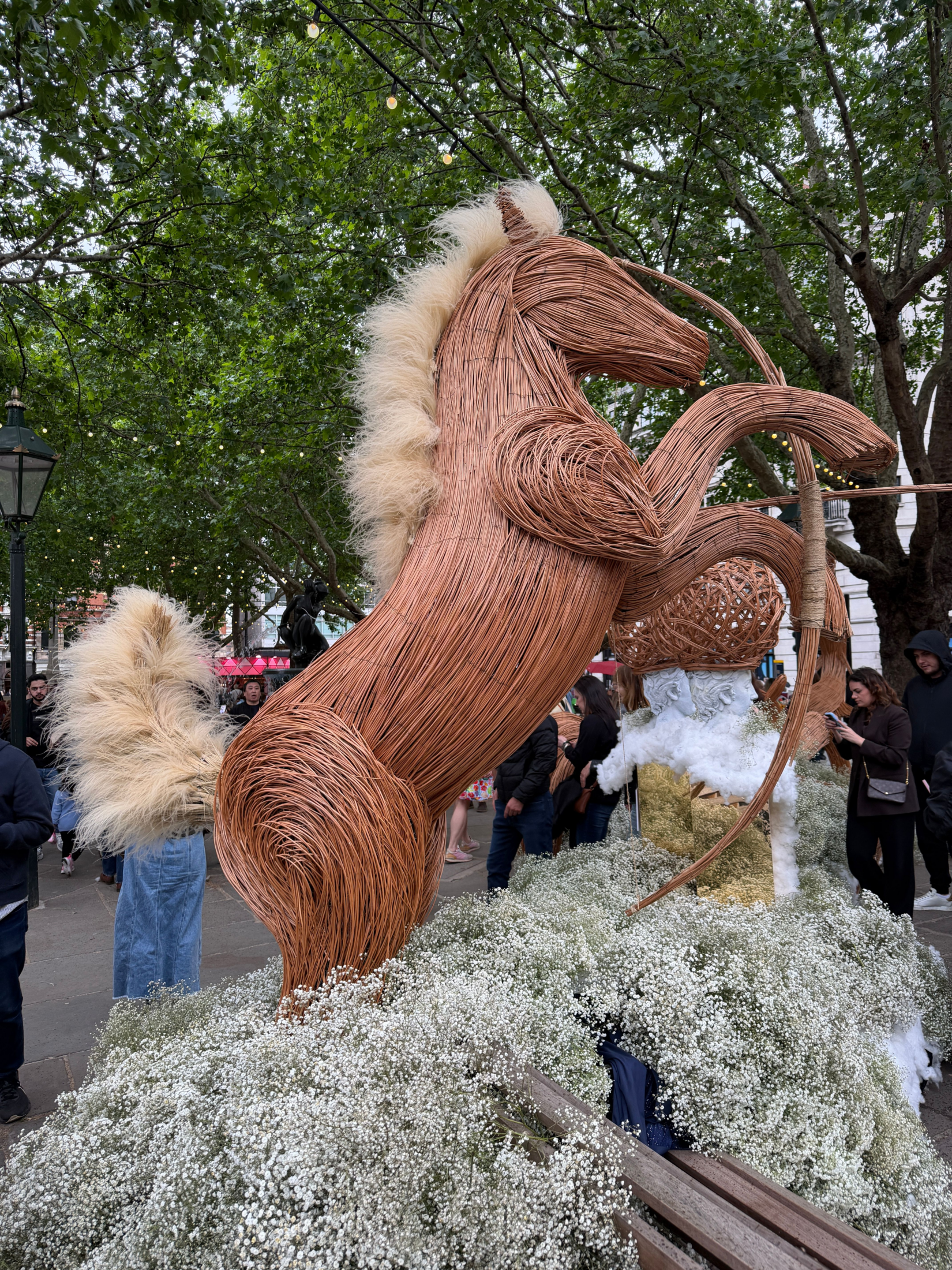
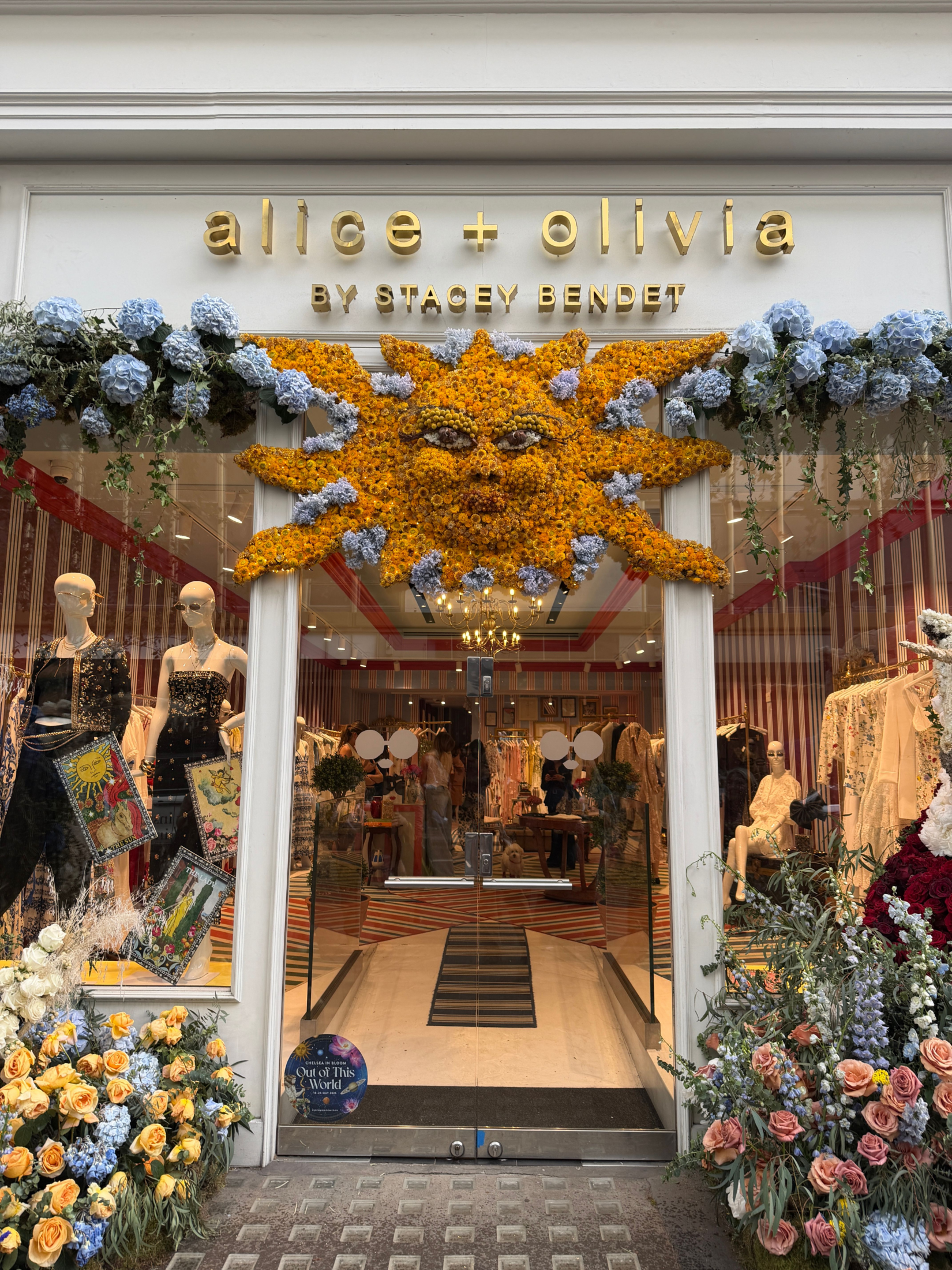
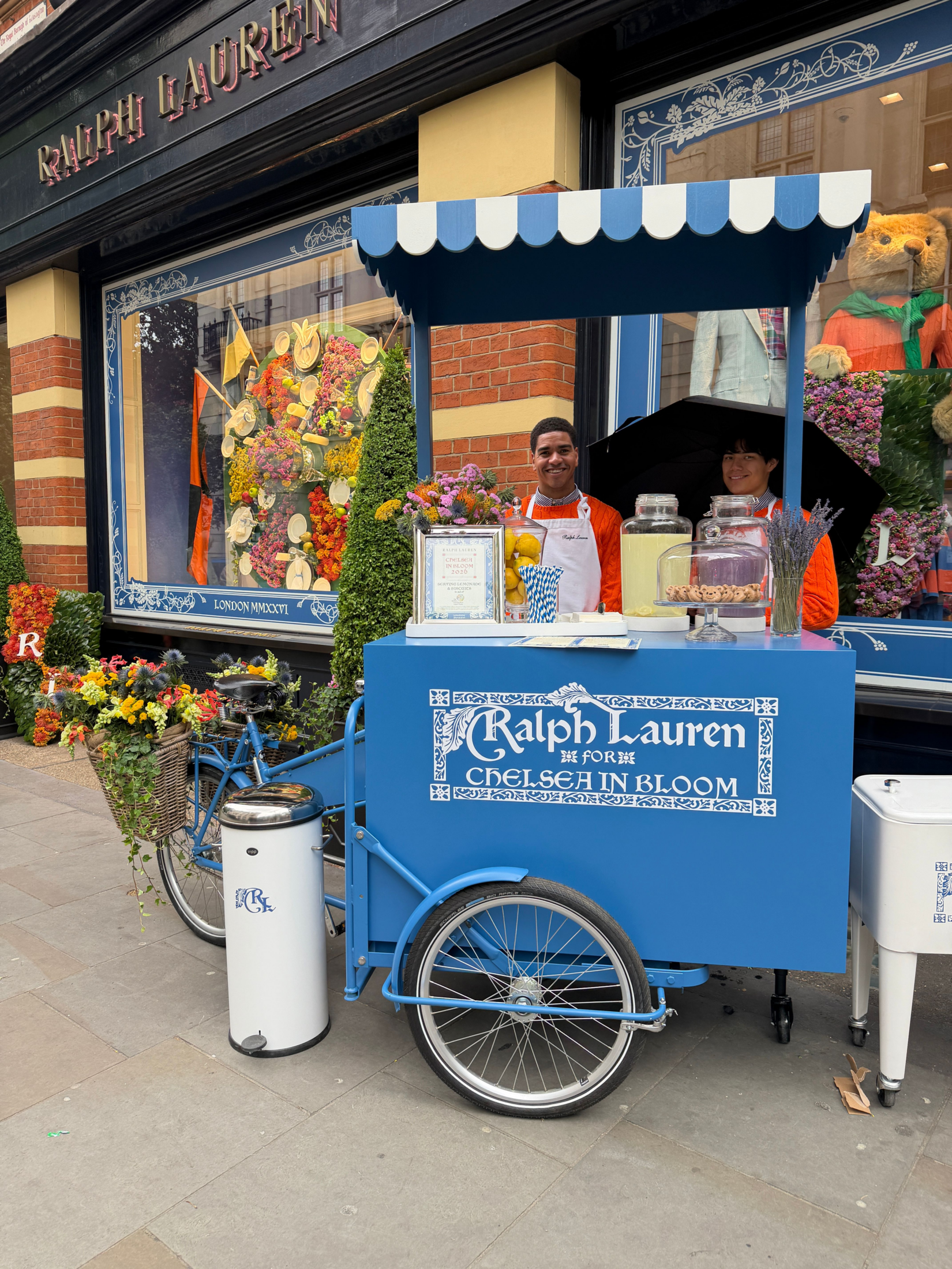
This spirit showed up beautifully across Chelsea in Bloom where storefronts became immersive installations—highly photographable, socially shareable, and emotionally engaging.
04. The Experience Economy is Everything
Pop-Ups, Activations & “Moments” Drive Engagement
London understands that people no longer simply shop, dine, or attend—they experience.
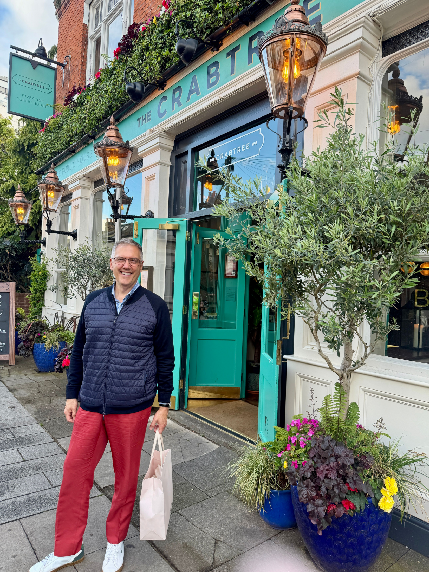
Throughout the city, hospitality became a storytelling tool. Pop-up activations, floral installations, branded cafés and pubs, interactive moments, clever signage, unexpected music pairings, and photo-worthy visual details transformed ordinary destinations into memorable experiences.
Every touchpoint felt intentionally designed to create both emotional connection and social engagement.
What stood out most was that these experiences rarely felt corporate.
Instead, they felt witty, immersive, and culturally aware—offering visitors something to discover, participate in, and remember long after they left.
05. Heritage with Edge
Tradition Reimagined Through Personality
One of London’s greatest strengths is its ability to celebrate heritage while still feeling fresh and rebellious.
Historic architecture, pubs, tailoring, floral traditions, and craftsmanship were layered with contemporary irreverence—resulting in spaces that felt rooted yet modern.
This tension between old and new was especially visible during Clerkenwell Design Week.
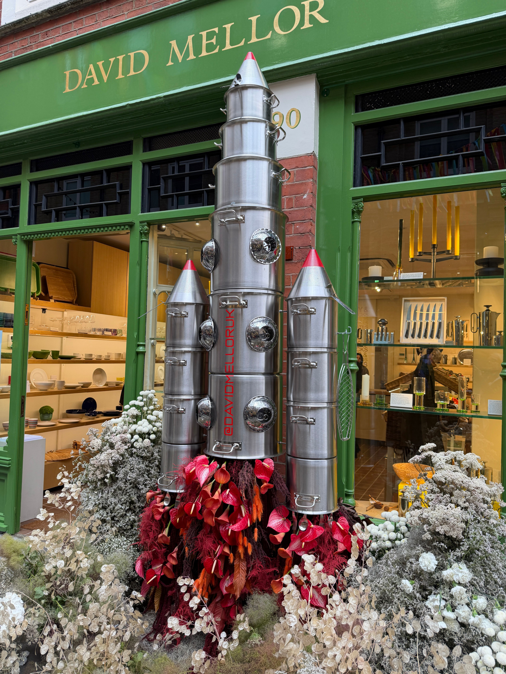
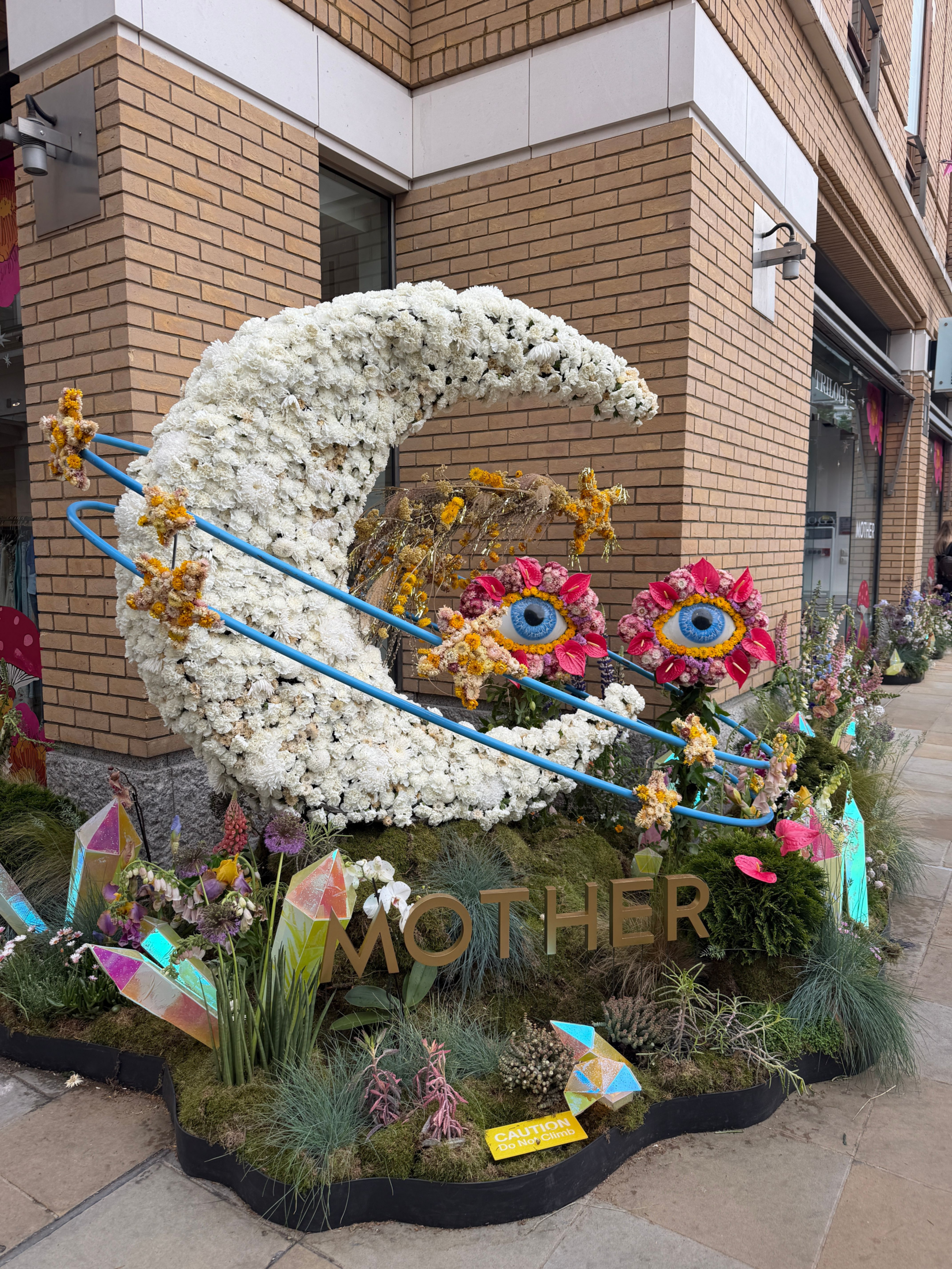
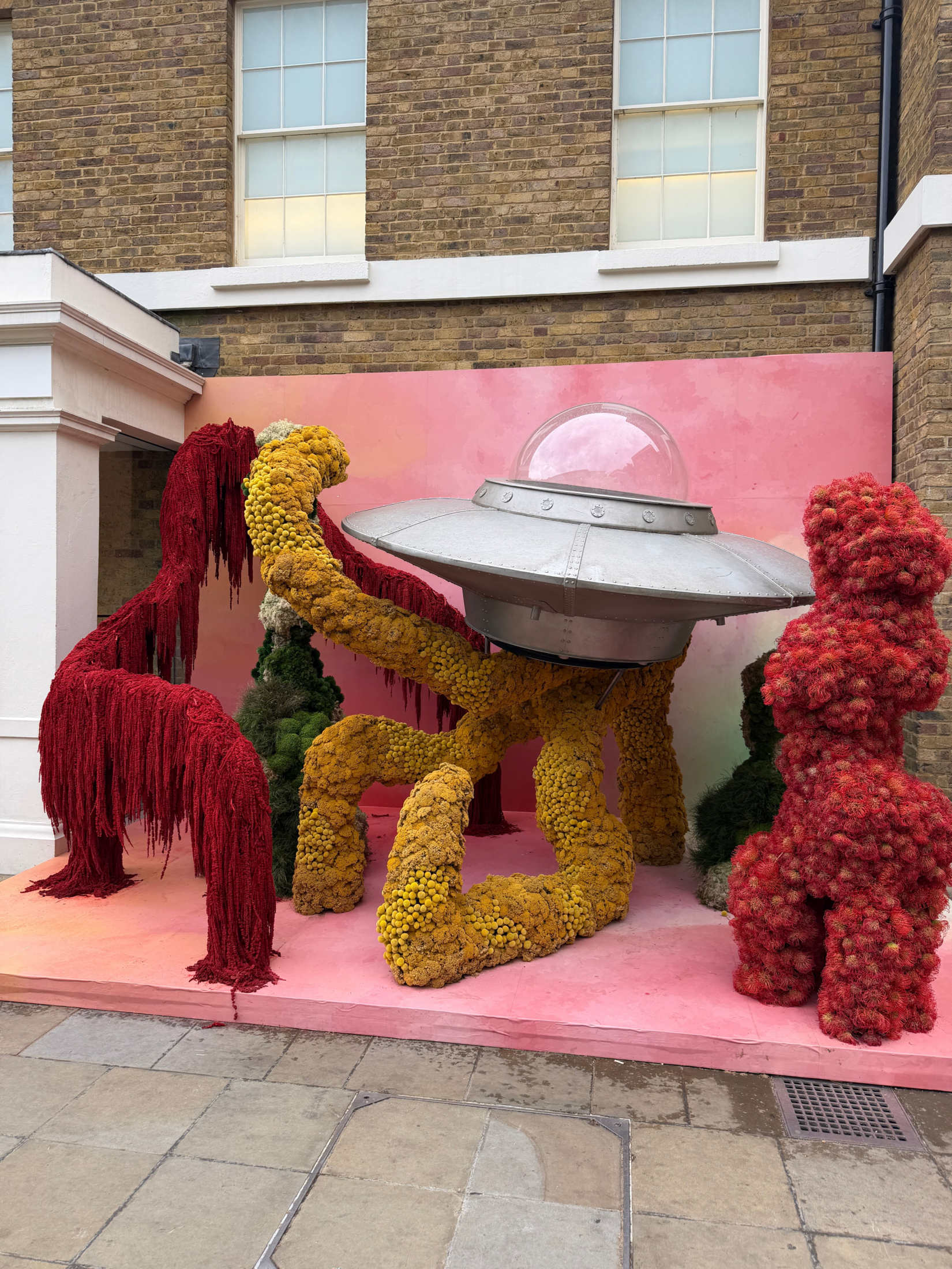
06. Escapism Takes Flight
Rockets, UFOs & Cosmic Nostalgia
One of the most unexpected (and delightful) themes woven throughout Chelsea in Bloom was a recurring sense of escapism through cosmic references: rockets, aliens, UFOs, stars, moons, and surreal “out of this world” installations appeared across floral displays and storefront storytelling.
At first glance, the theme felt playful and whimsical. But looking closer, it reflected something deeper happening culturally: a desire for optimism, imagination, and wonder.
London embraced the idea that design should transport us emotionally away from the heaviness of everyday life.
What made these installations especially successful was their balance of humor and sophistication. Metallic finishes, reflective materials, glowing details, and oversized sculptural florals transformed what could have felt kitschy into something immersive, artistic, and incredibly photographable.
The result was a citywide reminder that fantasy and nostalgia still have an important place in luxury experiences. Maybe that was the real message behind the UFOs and rockets: not escape from reality, but permission to dream bigger.
Final Takeaway: London Isn’t Asking Permission
If Milan this year represented restraint and refinement, London represented personality and permission.
Permission to mix color. Permission to be playful. Permission to embrace nostalgia.
Permission to create moments that feel joyful, expressive, and deeply human.
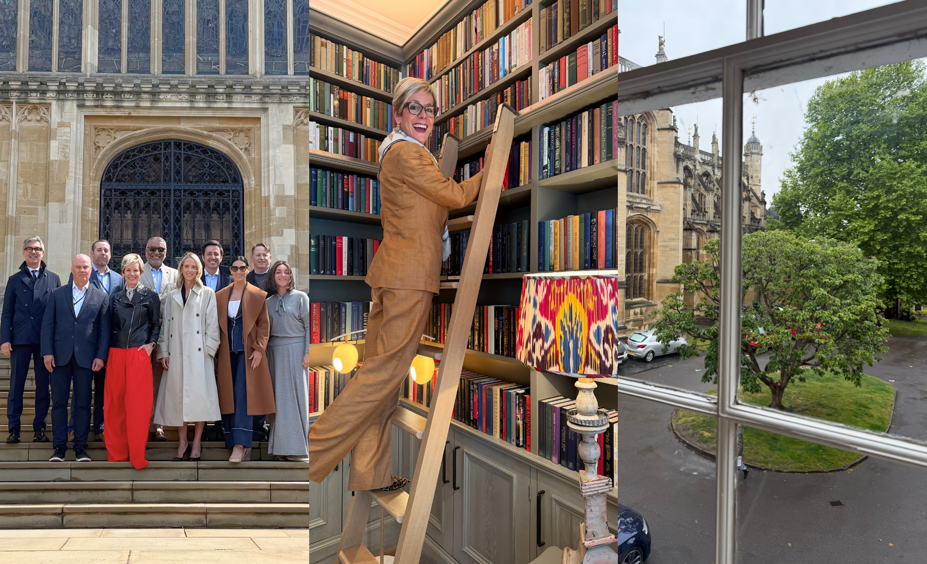
From our NKBA Board Leadership Dialogue at Windsor Castle to the vibrant streets of Clerkenwell and Chelsea, this trip was a reminder that great design doesn’t simply solve problems—it creates emotion, sparks conversation, and invites us to experience the world with curiosity and delight.
Like what you see?
There's more where that came from.